


Financial markets are driven by information.
The traders who have access to better data, better tools, and a deeper understanding of market mechanics consistently operate with an advantage over those who rely only on simplified views of price.
Large market participants, hedge funds, proprietary trading firms, and high-frequency trading desks, do not interpret markets using basic chart patterns alone.
They rely on detailed market data that reveals how orders are executed and how liquidity is consumed inside the auction process.
For traders, especially intraday traders and scalpers, accessing this deeper layer of information can dramatically improve the way market activity is interpreted.
One of the most powerful tools used for this purpose is the Footprint Chart.
Footprint charts visualize the actual transactions happening inside each candle, showing how many contracts were traded at each price level and which side of the market was more aggressive.
In this guide you will learn:
What a footprint chart is and how it works
How traders read buying and selling aggression in the market
The different types of footprint charts used in order flow trading
What is a Footprint Chart
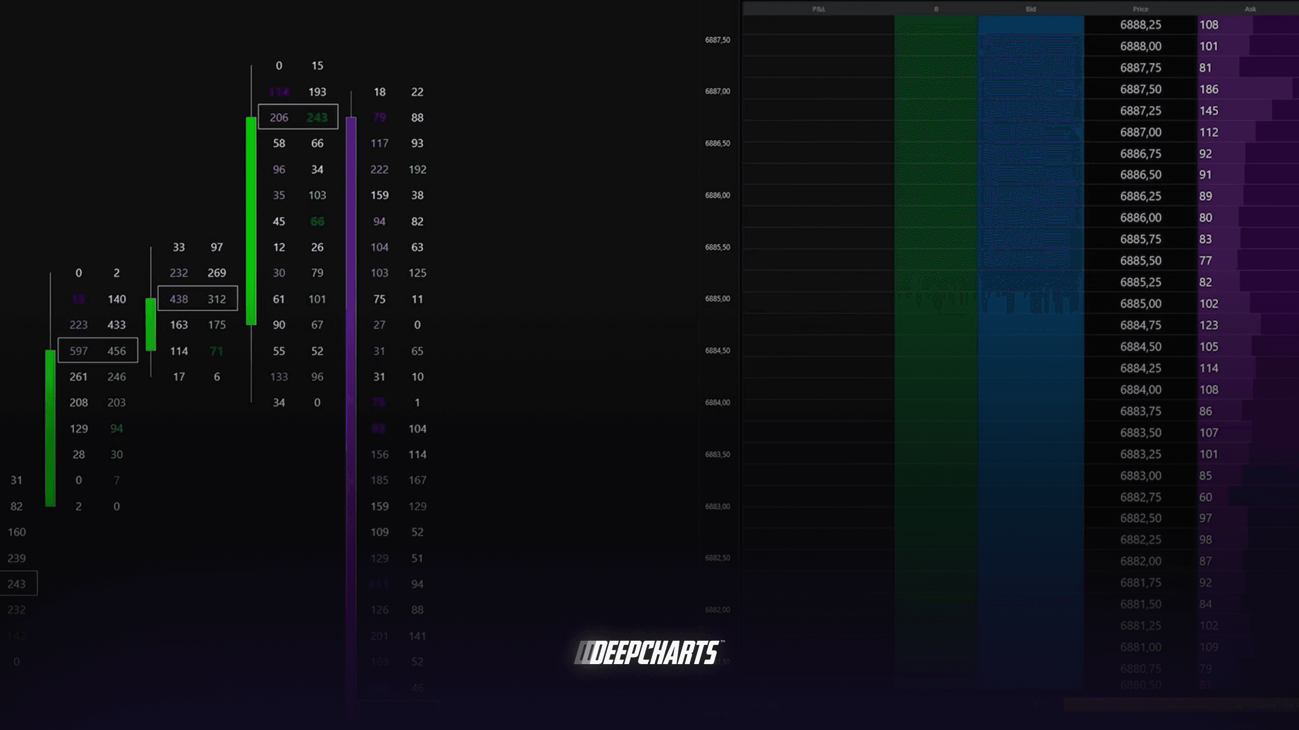
A footprint chart is a type of order flow chart that shows how many contracts were executed at every price level inside a candle.
Instead of displaying only the opening, closing, high, and low prices, footprint charts reveal the actual transactions that took place inside the market.
Each price level in the candle displays the number of contracts executed at the bid and the ask.
This allows traders to see how the auction between buyers and sellers unfolded during that time period.
To understand this process, it is important to remember that markets operate through a bid-ask auction.
Passive traders place limit orders in the order book:
buy limit orders at the bid
sell limit orders at the ask
Aggressive traders interact with these orders using market orders.
When aggressive buyers lift the ask, they consume sell liquidity and push price higher.
When aggressive sellers hit the bid, they consume buy liquidity and push price lower.
A footprint chart records these executed transactions and organizes them inside the candle.
Instead of only seeing that price moved, traders can observe how many contracts were traded at each level and which side of the market initiated the move.
This makes footprint charts one of the most powerful tools for understanding real market participation.
How to Read the Aggression in the Market
One of the main advantages of footprint charts is the ability to measure aggression in the auction process.
Every trade involves both a buyer and a seller, but not both participants act with the same level of initiative.
Aggressive traders use market orders to immediately execute trades, while passive traders provide liquidity through limit orders.
Footprint charts allow traders to visualize this interaction by analyzing two key elements:
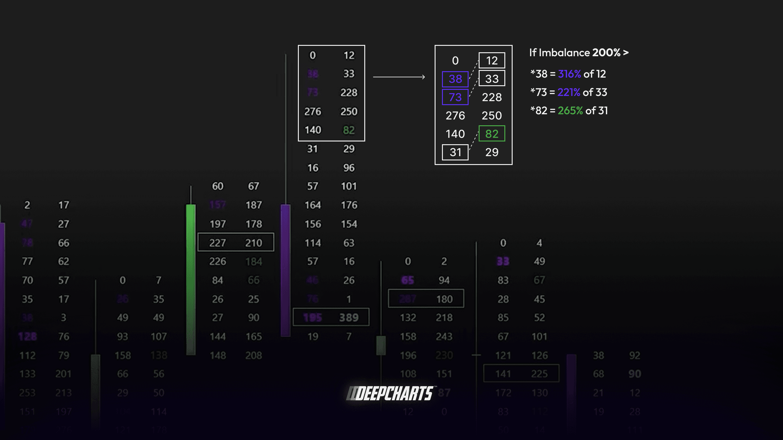
Order Flow Imbalances
An imbalance occurs when aggressive activity on one side of the market is significantly larger than on the other side.
For example, if a large number of contracts are bought at the ask compared to those sold at the bid, the buying pressure at that level dominates the auction.
These imbalances are typically highlighted automatically by footprint chart software and are calculated diagonally because the aggressive buyers at the ask are compared with the sellers at the bid below.
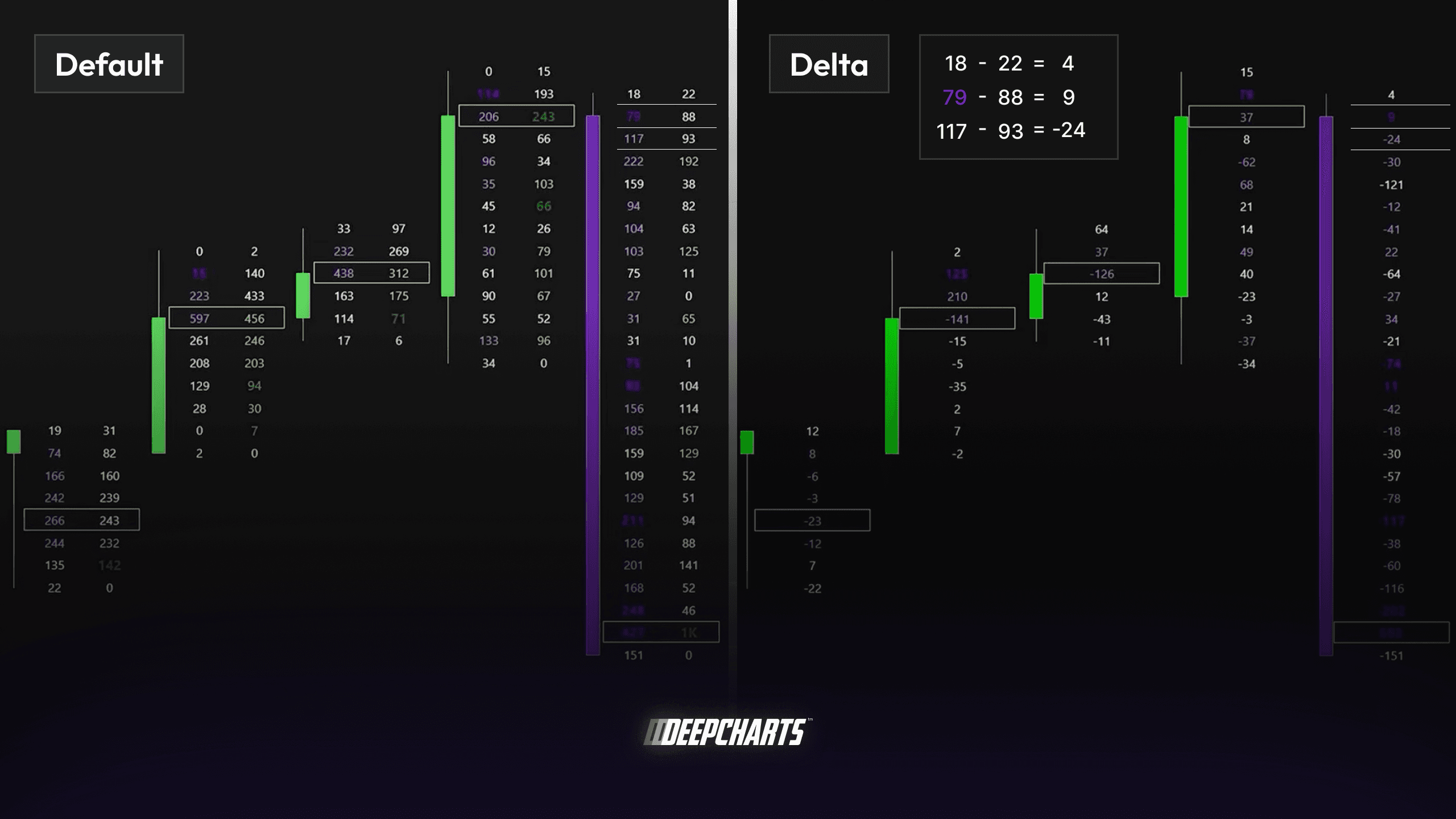
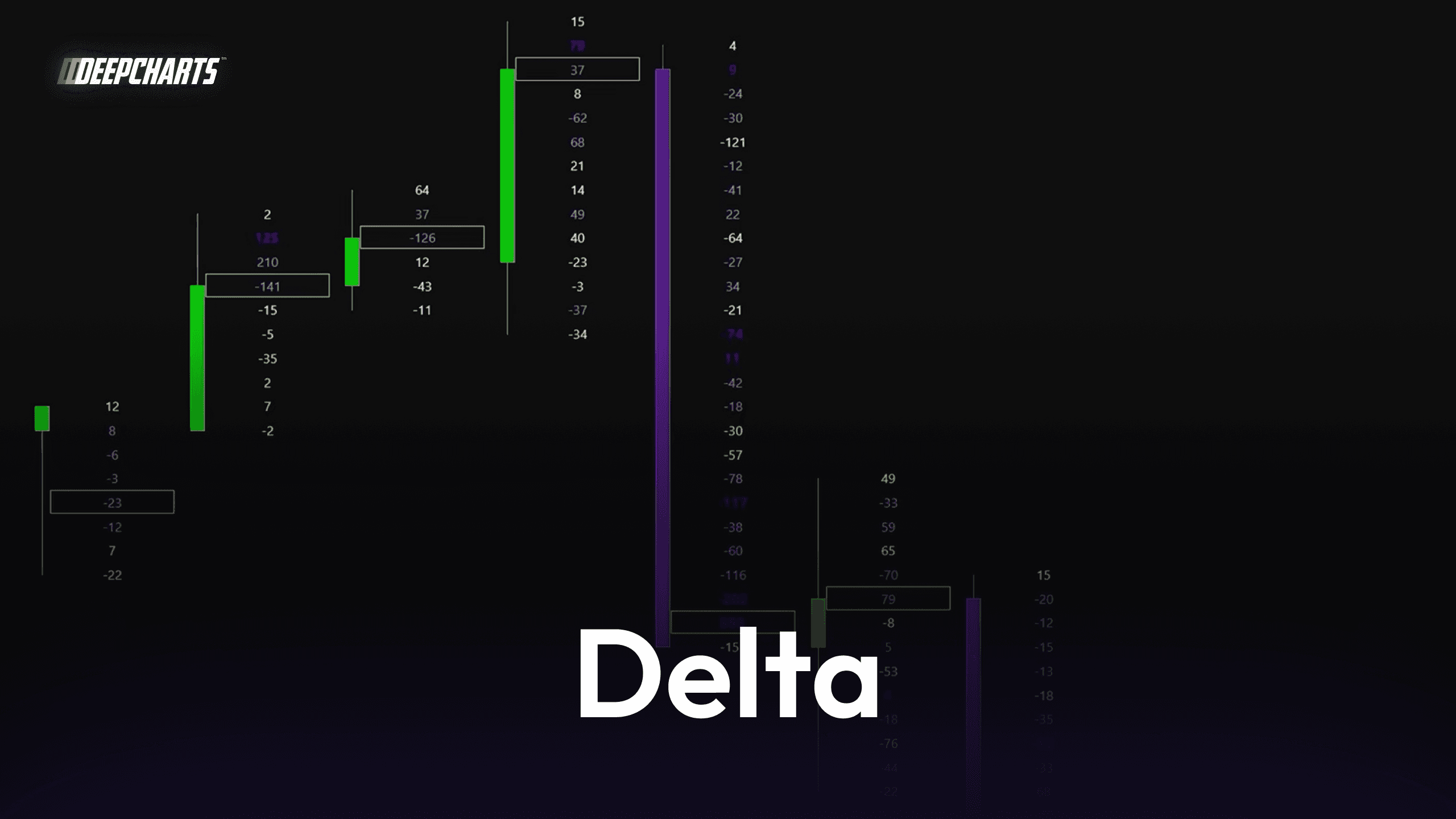
Delta
Delta measures the difference between buying and selling volume.
Delta = Buy Volume − Sell Volume
If aggressive buying is stronger, delta becomes positive.
If aggressive selling dominates, delta becomes negative.
Many footprint platforms color price levels or candles based on delta values:
green tones indicate buying pressure
red tones indicate selling pressure
Clusters of imbalances and strong delta shifts often signal initiative phases in the market, where one side of the auction begins to dominate the other.
Types of Footprint Charts
Footprint charts can be visualized in different formats depending on which information traders want to emphasize.
The three most common types are Bid-Ask footprint, Delta footprint, and Volume footprint
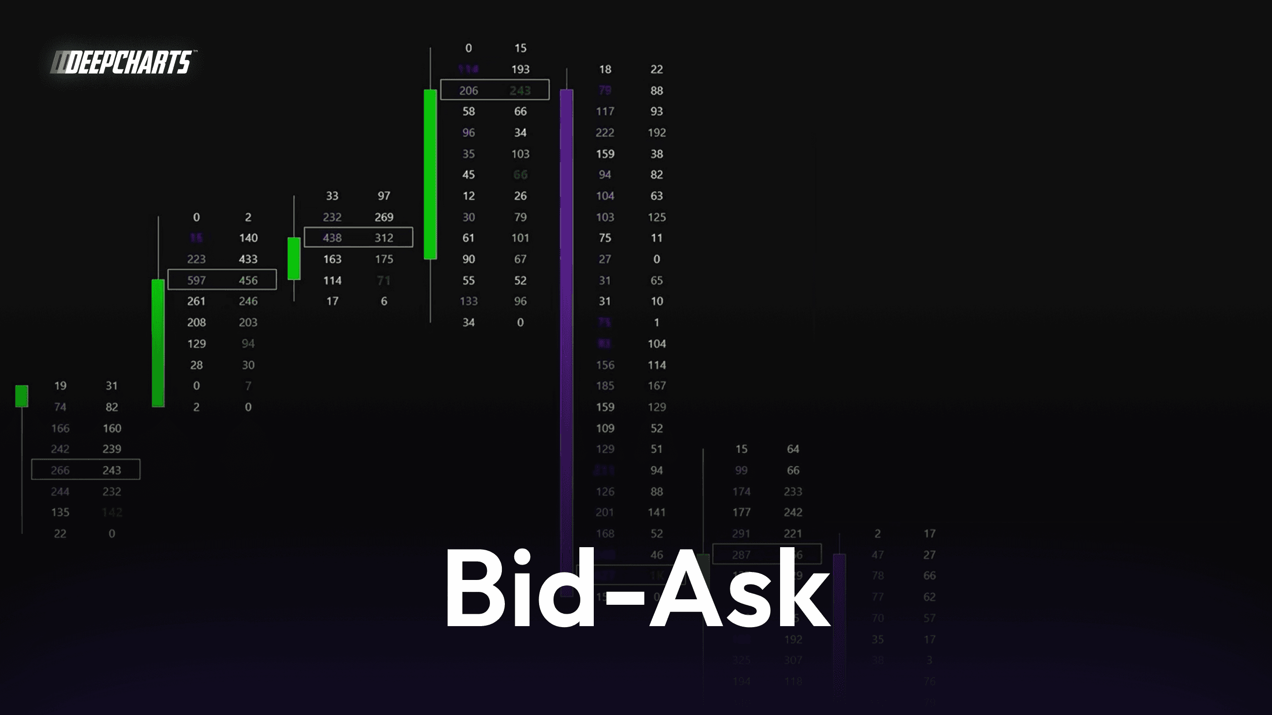
Bid-Ask Footprint
The Bid-Ask footprint is the most common and detailed format.
Each price level inside the candle displays two numbers:
contracts executed at the bid
contracts executed at the ask
This allows traders to directly compare aggressive buying and selling activity at every level.
Bid-Ask footprints are particularly useful for identifying:
order flow imbalances
absorption by large participants
aggressive buying or selling pressure
Because they show both sides of the transaction, they provide the most detailed view of the auction process.
Delta Footprint
The Delta footprint focuses on the difference between buying and selling pressure.
Instead of displaying bid and ask separately, it shows the net delta value for each price level or for the entire candle.
This simplifies the visualization of aggression and makes it easier to identify momentum shifts in the market.
Delta footprints are often used to detect:
strong directional pressure
exhaustion of buyers or sellers
changes in momentum within a trend
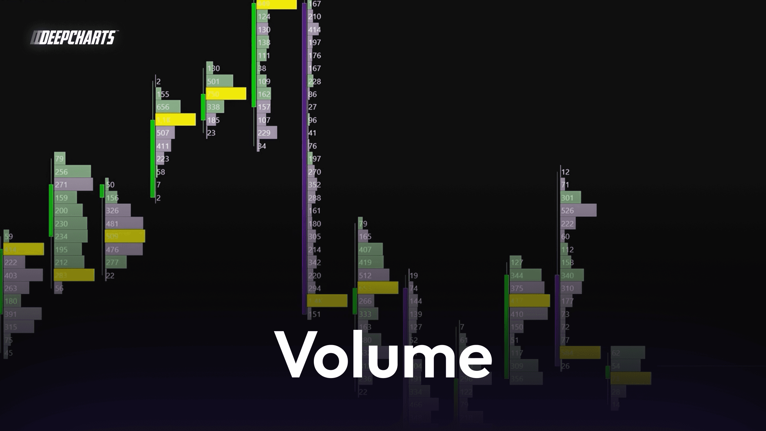
Volume Footprint
The Volume footprint displays the total traded volume at each price level regardless of direction.
Rather than separating buyers and sellers, it highlights where the highest amount of trading activity occurred.
This helps traders identify areas where the market spent significant time exchanging contracts.
These areas often correspond to zones of acceptance or liquidity concentration, which can play an important role in future price reactions.
Volume footprints are frequently used together with Volume Profile analysis to better understand where the market has established fair value.
So this was the Footprint Charts / Deep Print Charts Explained.
If you want to truly understand how footprint charts and order flow reveal real buying and selling activity, this is just the beginning
In the video below, you’ll see how to read delta, imbalances, and aggressive execution directly inside the candle
👇 Watch the full breakdown here

Subscribe for more on order flow, footprint charts, and institutional trading strategies

Deepcharts Team
·
Share this on