Features
Updated:
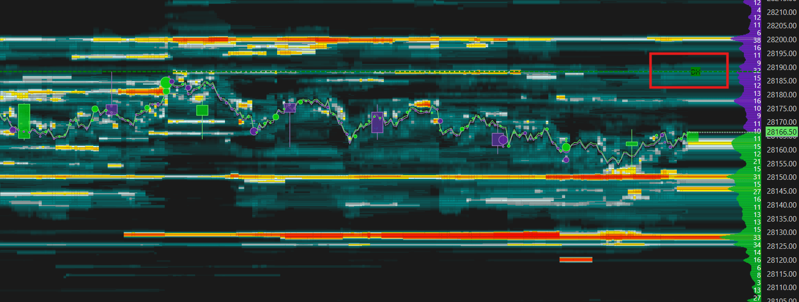
The Heatmap is the core of DeepDom and the reason the platform exists in the first place. Every other tool — the DOM, Bubbles, CVD, VWAP — adds context and confirmation. But the Heatmap is where you see the full picture of market intent laid out visually across both price and time simultaneously.
Most traders look at a price chart and see what already happened. The Heatmap lets you see what the market is planning before it happens — every horizontal band of color is a concentration of limit orders sitting in the order book at that price level. Real money. Real positions. Real intentions. The thicker and more intense the color, the more committed the liquidity is at that zone.
What makes it uniquely powerful is that it combines two completely different data streams into one view — executed market order data from Time and Sales, and live limit order data from the DOM. This means you are not just seeing where price has been or where orders are waiting. You are seeing both at the same time, which allows you to understand how price is interacting with liquidity as it happens.

The color intensity is a direct measure of order concentration. Red means the heaviest liquidity, orange the second highest, and as colors move toward yellow, white, blue, and black, the liquidity becomes progressively thinner. When a thick red or orange band forms at a level, price will almost always react when it gets there. The Heatmap lets you see these zones forming in advance — often minutes before price even gets close.
Because DeepDom saves and records this data over time, you can also see exactly how a zone developed. Liquidity building gradually over 30 or 40 minutes tells a very different story from a large order that appeared suddenly just as price approached. The first is a deliberate, pre-planned position. The second is a reactive one. Understanding how the liquidity formed — not just where it is — is what separates a trader who reads the Heatmap at a surface level from one who truly understands order flow.
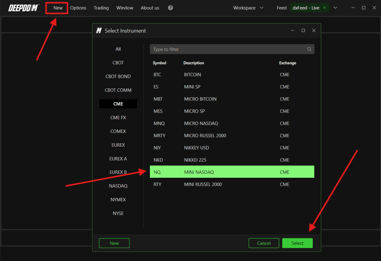
Opening a Heatmap
After connecting your data feed, follow these steps to open a new chart:
Connect the datafeed first, make sure its green (connect), If the connection - Yellow (Still Looking for the connections), and Red (Connection is disconnected)
Click New in DeepDom
Select the financial instrument you want to display from your list of subscribed symbols (Make sure you have setup your Symbol Manager setting correctly)
Click Select at the bottom right to confirm
Configuring MBO / MBP Data Source
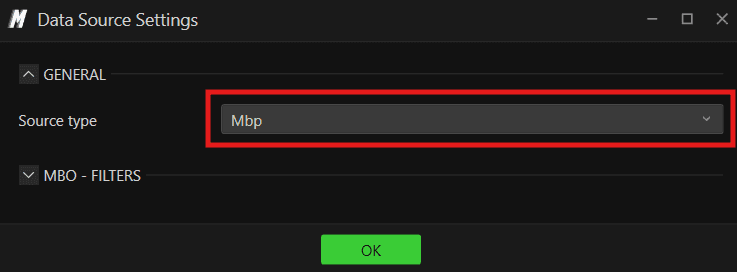
Source Settings allows you to configure the data source for each individual chart. This is where you define whether the chart uses MBP or MBO data — which directly affects which DeepDom features are available to you.
To access Source Settings, right-click anywhere on the chart and select Source Settings from the menu.

What is MBP and MBO?
MBP (Market By Price) MBP shows you the total volume available at each price level in the order book — combining all individual orders at that price into a single number. This is the standard market depth view that most traders are familiar with. It shows you what is at each price level but does not tell you anything about the individual orders behind that number.
MBO (Market By Order) MBO goes one level deeper. Instead of showing combined totals at each price level, MBO shows you the data for each individual order in the book — including its size, status, and how it changes over time. This is what makes it possible for DeepDom to identify Iceberg orders, Stop orders, and other advanced order flow features.
In simple terms — MBP tells you how much is at a price level. MBO tells you who is at that price level and how they are behaving.
Which Data Feeds Support MBO?
MBO data is only available on specific data feeds. Currently in DeepDom:
dxFeed Market Depth — supports MBO
Rithmic Market Depth — supports MBO
If your data feed supports MBO, switching to it will unlock the full power of DeepDom's advanced order flow tools.
General
Source Type Defines the data source type used for the chart. You can choose between:
MBP — uses Market By Price data. Standard market depth showing combined volume at each price level
MBO — uses Market By Order data. Granular order-level data that enables advanced features like Iceberg order detection

Switch to MBO if your data feed supports it and you want to use DeepDom's full suite of order flow tools.
Notes - If you select MBO but your data feed does not support it: Some information may not be available or may not display correctly on the chart. Indicators that rely on MBO data, so it may not show the data or behave unexpectedly. If this happens, switch the Source Type back to MBP or contact your data provider to confirm whether MBO is included in your subscription.
MBO Filters
These filters apply when the chart is set to MBO mode and allow you to control which individual orders are included in the analysis:
Min. Volume Sets the minimum volume an individual order must have to be included in the MBO analysis. Setting this above zero filters out very small orders — keeping the focus on orders that are large enough to be meaningful. For example, setting this to 10 means only individual orders of 10 contracts or more will be tracked by the indicator.
Exclude Market Maker When enabled, orders identified as coming from market makers are excluded from the MBO analysis. Market makers constantly place and cancel orders as part of their normal activity — this can create a lot of noise in the data. Excluding them helps you focus on genuine institutional and trader activity rather than routine market making.

Notes - If you are unsure which to use: Start with MBP — it works with all data feeds and covers the majority of trading scenarios. Switch to MBO only when you specifically want to use the advanced order flow features that require it, and only if your data feed supports it.
Understanding Liquidity
Most traders only see what has already happened on a price chart. The Heatmap shows you something far more valuable — where the money is waiting before price even gets there. By default, the chart loads with one hour of liquidity history, meaning you are not just seeing where orders are sitting right now — you can see how that liquidity has been building, shifting, and disappearing over time. This gives you a forward-looking view that no standard price chart can offer.
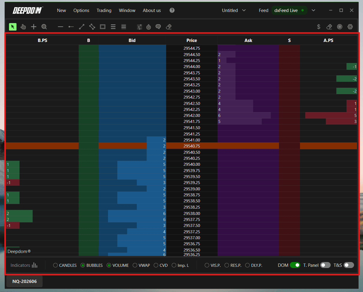
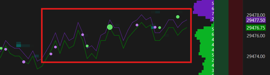
Limit orders from the DOM are displayed directly on the chart:
Sell Limit orders - Purple
Buy Limit orders - Green

The Heatmap doesn't just show current limit orders — it saves and plots this information over time, so you can see how liquidity has built up, increased, decreased, or been cleared at any price level. This matters because a limit order that has been sitting at a level for a long time is far more significant than one that just appeared — it tells you that someone is genuinely committed to that price.
How to read the Heatmap intensity:
DeepDom uses a visual intensity scale to show the concentration of limit orders at each price level:
The lighter and clearer the area appears, the higher the concentration of limit orders on the book.
The darker or less visible the area appears, the lower the concentration of limit orders on the book.
This intensity adjusts automatically to current market conditions. If a new large limit order appears, the entire scale shifts to reflect the new context. This instantly tells your eye where the heaviest orders are sitting without having to read a single number — and price almost always reacts when it reaches those zones.
How to read Buy and Sell limits:
The separation of green (Buy Limit) and violet (Sell Limit) orders is equally important. Green bands below price tell you where buyers have placed their limit orders and are waiting. Violet bands above price tell you where sellers are positioned. When price moves into a thick green band, you are watching it enter a zone of heavy passive buying interest — the buyers there will either defend that level and cause a bounce, or get overwhelmed, causing price to accelerate through.
Either outcome is tradeable information.

How to read Fresh vs. Persistent Liquidity:
Not all limit orders in the book carry the same weight — and this is one of the most important distinctions you can make when reading the Heatmap.
Fresh liquidity refers to limit orders that have just appeared in the book. These are newly placed orders — traders who have just decided to position themselves at a specific price. Fresh liquidity tells you about new intent entering the market right now. However, because these orders just appeared, they are also more likely to be cancelled or moved if price does not reach them quickly. A sudden appearance of fresh liquidity at a key level as price approaches can signal a reactive, defensive order — placed in response to what price is doing rather than as a pre-planned position.
Persistent liquidity refers to limit orders that have been sitting in the book for a significant amount of time without being cancelled or filled. These are resting, committed orders — traders who placed their order at a specific price and have held it there through multiple price movements and market conditions. Persistent liquidity is far more significant because it tells you that someone genuinely believes that price level is worth defending. They have had multiple opportunities to cancel or move their order and have chosen not to. When price finally reaches a zone of persistent liquidity, the reaction is far more likely to be strong and sustained.


How to use both together:
When you see persistent liquidity at a level, that is a zone worth marking and watching. The longer it has been sitting there, the more committed the participant behind it.
When you see fresh liquidity appearing suddenly at a level as price approaches, be more cautious — it may be a reactive order that gets pulled before price even reaches it.
The most powerful setup is when persistent liquidity and fresh liquidity are both building at the same level — it means both committed, patient participants and new aggressive participants are positioning at that price simultaneously, significantly increasing the probability of a strong reaction.
How to read the history:
Because DeepDom saves and plots this data over time rather than just showing a current snapshot, you can look back and see exactly how a level developed. A thick band of liquidity that has been sitting at a level for a long time tells you that someone is committed and waiting. A large order that appeared suddenly just as price approached tells a very different story. Reading the history of how liquidity forms — not just where it is right now — is what gives you the full picture.
Note: To access Market Depth data, you need Level 2 from your data feed. DeepDom supports analysis of over 1,000 book levels.
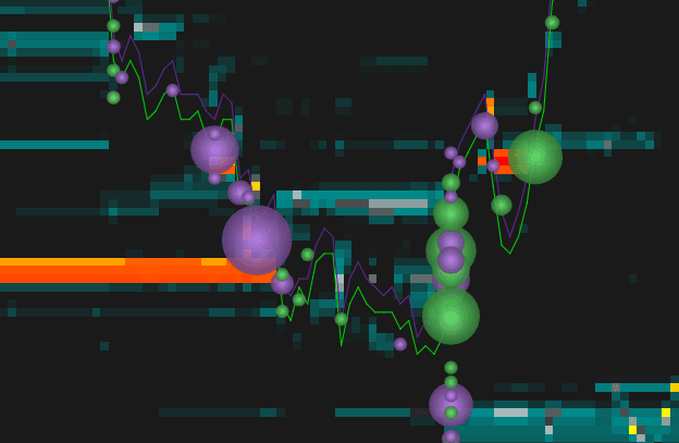
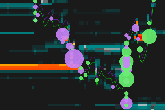
Volume Bubbles
Volume Bubbles give you a tick-by-tick visual record of every market execution plotted directly on the chart at the exact price and time it happened. Every trade that hits the market appears as a bubble — green for a market buy (executed at the Ask, meaning an aggressive buyer hit the offer) and violet for a market sell (executed at the Bid, meaning an aggressive seller hit the bid). The size of each bubble is proportional to the size of that execution — a small bubble means a small trade, a large bubble means a large trade was just executed at that price.
Green bubble = Buy market order (executed at Ask)
Violet bubble = Sell market order (executed at Bid)
Bubble size = proportional to the size of the execution
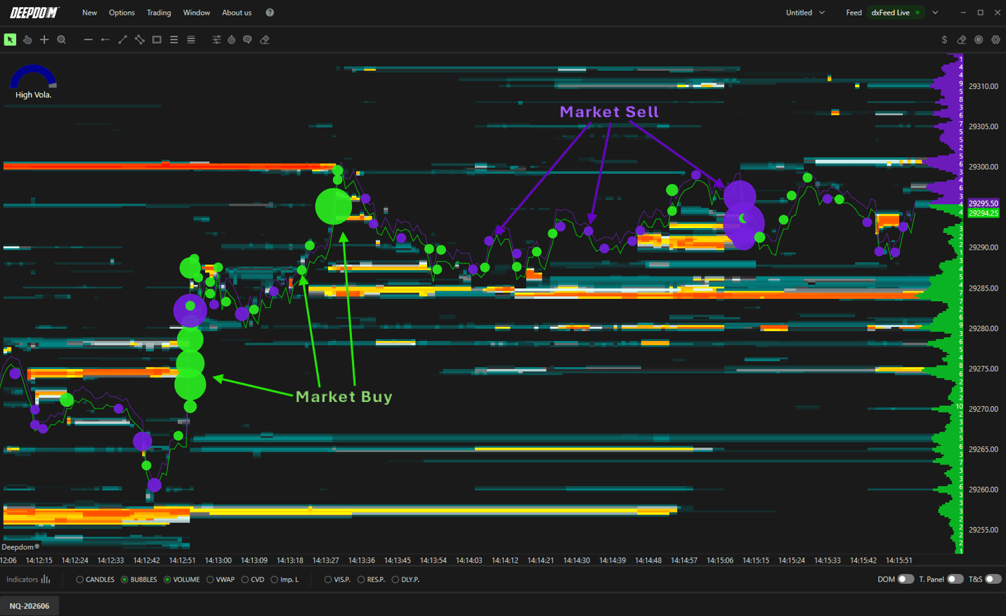
Size tells you who is participating. Small bubbles scattered across the chart are noise — retail activity, small orders, nothing significant. But when you see a cluster of large bubbles forming at a specific price level, that is a signal that a meaningful participant — an institution, a fund, a large trader — is actively executing at that zone. And the color tells you their direction.
When you see a cluster of large green bubbles, aggressive buyers are entering the market in size. When you see a cluster of large violet bubbles, aggressive sellers are hitting the market in size. When both colors appear in large size at the same level, there is a significant battle between buyers and sellers at that price — a level where the outcome will likely determine the next directional move.
The most powerful use of Volume Bubbles is watching for exhaustion. If price is pushing higher but the green bubbles are getting smaller and violet bubbles are beginning to appear in size, buyers are losing conviction and sellers are starting to step in — often a sign that the move is running out of fuel before price has even turned on the chart.
Combined with the DOM and Heatmap, Volume Bubbles give you the complete order flow picture — the DOM shows you where orders are waiting, the Heatmap shows you where liquidity has been building, and the Bubbles show you exactly where and how aggressively the market is actually trading against that liquidity in real time.
NOTE - For a full breakdown of all Volume Bubble settings, display modes, sizing options, and grouping configuration, check out the dedicated article here — Volume Bubbles Guide
Indicators
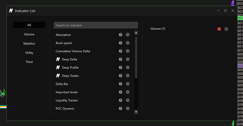
Adding a New Indicator
Click Indicators in the lower left corner of the chart
A window will open with the full list of available indicators
Click the + next to any indicator to add it to the chart
Once added, you can adjust its settings or remove it at any time

Indicator Toolbar
At the bottom of the chart there is a quick-access Toolbar. Here is what each button does:
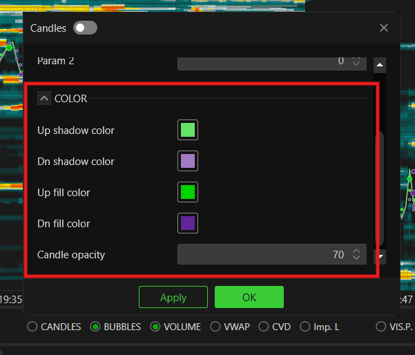
1. Candles
Candlesticks give you the most widely used form of price structure visualization in trading. Overlaying candles on top of the heatmap and DOM data is powerful because it lets you see exactly how price opened, closed, and moved within any given period while simultaneously reading the liquidity and order flow beneath it. Without candles, you are reading order flow in isolation. With candles, you can see how price actually responded to the liquidity — whether it respected a large Bid cluster and bounced, or broke straight through it — giving you the full picture of both what the market intended and what it actually did.
Enables classic Japanese candlesticks - you can define their parameters and customize their colors :
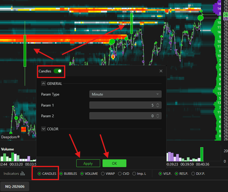
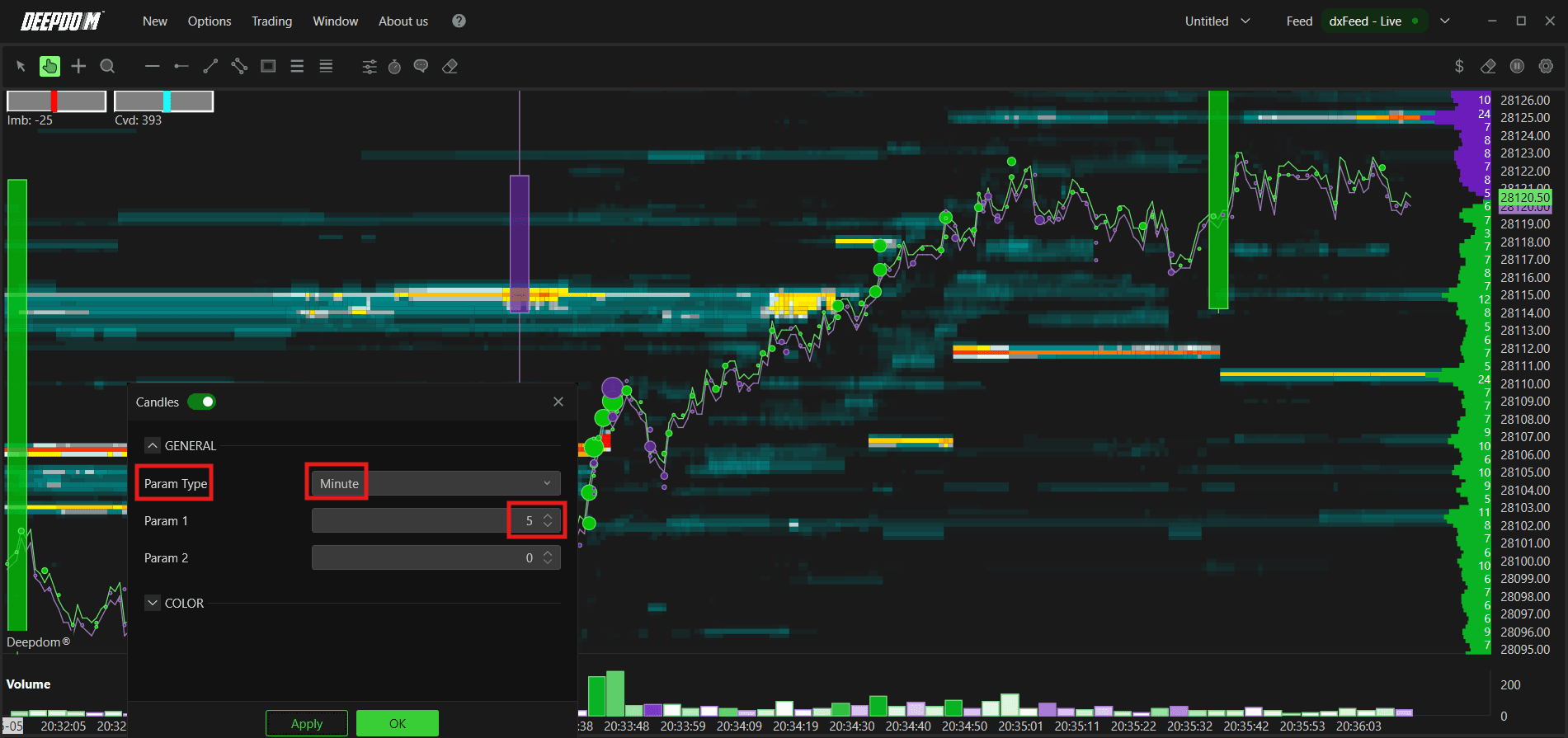
Param Type -
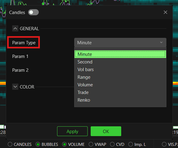
If you choose,Minin Param Type >> you can add the Candle Value inParam 1
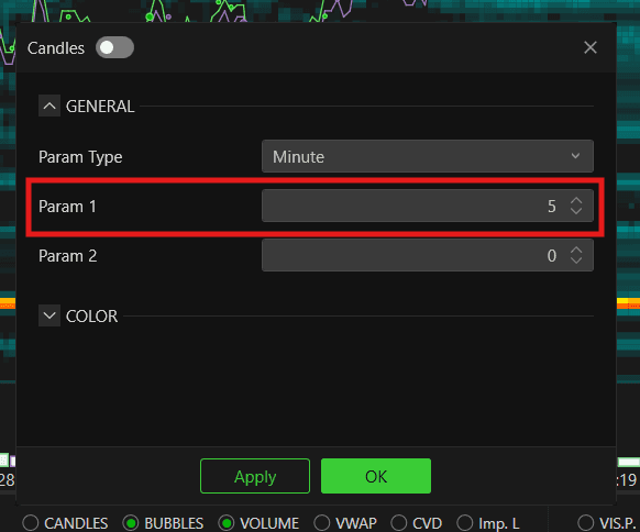
Min Candle View -
If you choose, Vol Bar in Param Type - You can add the Candle Value in Param 1 and Param 2
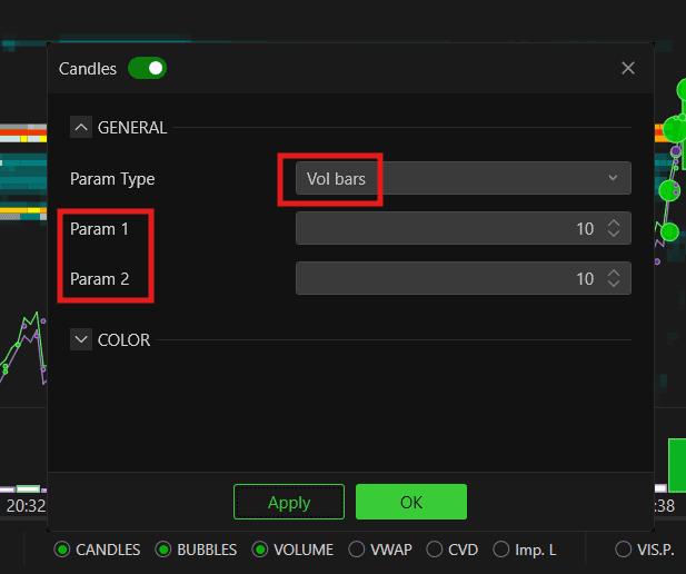
Vol. Bar View -
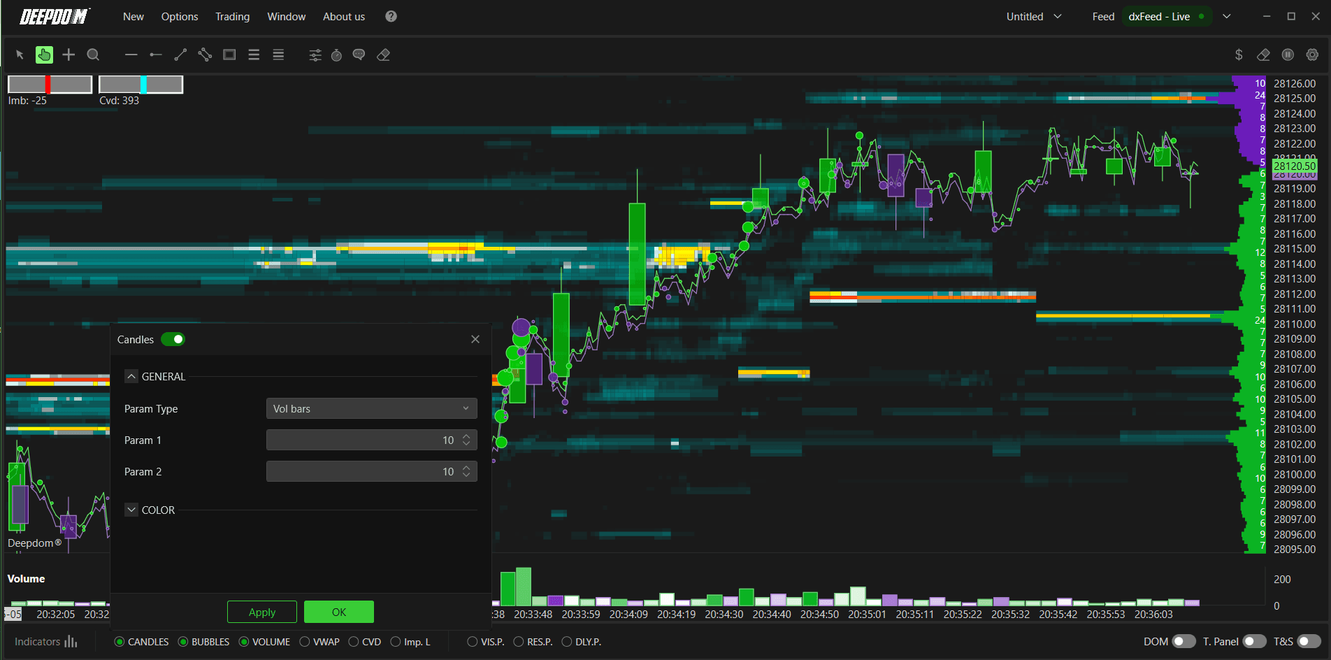
Color Setting
2. Bubbles
Bubbles give you a visual representation of where significant volume is being executed directly on the chart, plotted at the exact price and time the trade happened. The bigger the bubble, the larger the trade. This matters because large volume executions are not random — they almost always represent institutional or professional activity entering the market. By watching where the largest bubbles appear, you can see exactly which price levels are attracting the most serious participation, whether that volume is hitting the Bid or the Ask, and whether the Delta of that execution was strongly in one direction. When a cluster of large bubbles forms at a level and price stalls or reverses, it is a strong sign that significant players have been absorbed or have taken a position — giving you a clear, visual confirmation of order flow that numbers alone in the DOM or Time and Sales cannot deliver as instantly.
Enables Volume Bubbles and it lets you define their main settings :
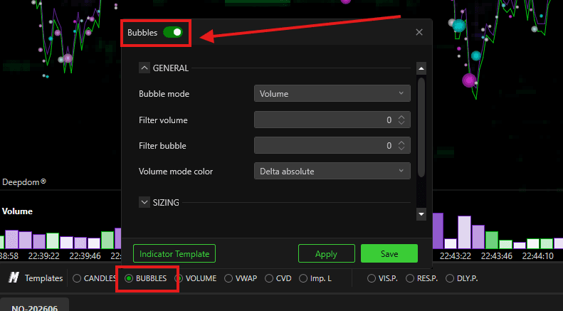
General
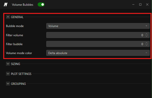
Bubble Mode — defines how the Volume Bubbles are displayed and colored on the chart. You can choose between:
Ask Bid Split — displays each bubble split between Ask and Bid volume separately
Delta — colors each bubble based on the difference between buying and selling volume
Volume — colors each bubble based on the total volume of the execution
Filter Volume — sets the minimum volume threshold for a bubble to appear on the chart
Filter Bubble — sets the minimum size for an individual bubble to appear
Out Std Dev Perc — defines the outer standard deviation percentage that controls bubble sizing
Std Dev Val — defines the standard deviation value used to scale bubble sizes
Volume Mode Color — defines how bubbles are colored based on volume. Options include Delta Absolute and others
Plot Settings
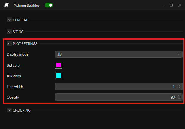
Display Mode — sets the visual display style of the bubbles. You can choose between 2D and 3D
3D Bubble View -
2D Bubble View -
Bid Color — sets the color of bubbles on the Bid side
Ask Color — sets the color of bubbles on the Ask side
Line Width — sets the thickness of the bubble outline
Opacity — controls the transparency of the bubbles. A value of 90 means the bubbles are mostly solid with slight transparency
Grouping

Grouping Mode Defines the overall method used to group executions:
Automatic — platform automatically determines the best grouping. Recommended for most users.
Time — groups all trades that occur within a defined time window into a single bubble.
Price — groups all trades that occur at the same or nearby price levels into a single bubble.
Price Aggr Mode — defines how price is aggregated for bubble display. You can choose between:
Extension — groups bubbles based on price extension only, moving in one direction
Extension and Retracement — groups bubbles based on both price extensions and retracements, capturing moves in both directions
Tick Grouping Mode — defines how ticks are grouped together. You can choose between:
Automatic — DeepDom automatically determines the tick grouping based on the instrument
Fixed — lets you manually define the exact number of ticks to group together
Tick Grouping Manual Ticks — when using Fixed tick grouping mode, this sets the exact number of ticks to group together
Note — Bubble Size & Bubble Grouping You can also quickly adjust the Bubble Size and Bubble Grouping directly from the Sliders in the chart toolbar at the top — without opening the full Bubbles settings window. This is useful for making fast visual adjustments while the market is live.

Note —For a complete breakdown of all Volume Bubble settings, display modes, sizing, and grouping configuration, check out the dedicated article here — Volume Bubbles Guide
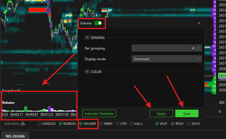
3. Volume
The Volume bar at the bottom of the chart tells you how much trading activity actually occurred during each period — not just where price moved, but how much conviction was behind that move. A price move on high volume is meaningful; a price move on low volume is suspicious and far more likely to reverse. By setting the display to Delta Dominant or Split, you can go beyond raw volume and see whether the volume in each bar was dominated by buyers hitting the Ask or sellers hitting the Bid — giving you an immediate read on who was in control during that period. This makes volume one of the simplest yet most important filters for confirming whether the order flow you are reading in the DOM and Heatmap is actually being backed by real participation or not.
Enables the Volume bar at the bottom of the chart. You can set the grouping and choose the display mode — Delta Dominant or Split :
4. VWAP
The VWAP (Volume Weighted Average Price) is the single most watched reference level by institutional traders, market makers, and professional desks throughout the trading day. It represents the true average price of every transaction that has occurred, weighted by volume — meaning it is not just a simple average of prices, but a reflection of where the majority of real money has actually traded. This matters because institutions benchmark their executions against VWAP, which means price tends to gravitate back toward it repeatedly throughout the session. When price is trading above VWAP, the market is in a bullish posture for the day. When it is below, bearish. When price moves away from VWAP on low volume and returns, that return is often a tradeable move. Combined with the DOM and order flow tools, VWAP gives you a powerful anchor point to understand whether price is stretched, fairly valued, or being actively defended by large participants.
Enable the VWAP (Volume Weighted Average Price) indicator and lets you define its main parameters. Once enabled, click the settings icon to configure:

General
Period Mode — defines the time period used to calculate the VWAP. You can choose between:
Daily — calculates the VWAP from the start of the current trading day
Minute — calculates the VWAP over a set number of minutes
Second — calculates the VWAP over a set number of seconds
Order — calculates the VWAP based on a set number of orders
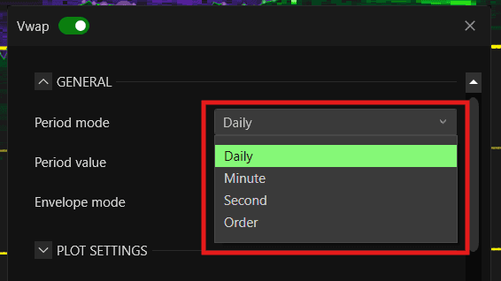
Period Value — sets the numeric value for the period chosen above
Envelope Mode — defines how the bands are calculated. You can choose between:
Standard Deviation — bands adjust automatically based on market volatility
Price Percentage — bands are based on a fixed percentage from the VWAP price

Plot Settings
Line Color — sets the color of the VWAP line
Line Width — sets the thickness of the VWAP line
Envelope Width — sets the thickness of the envelope bands
Envelope Style — sets the style of the band lines — for example Solid, Dash, or Dot

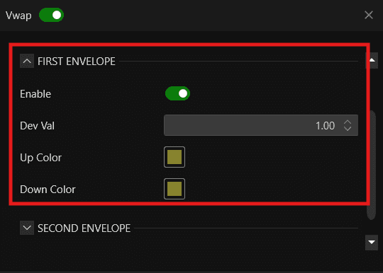
First Envelope
Enable — shows or hides the first envelope band
Dev Val — sets the standard deviation value for the first band. Default is 1.00
Up Color — sets the color of the upper first band
Down Color — sets the color of the lower first band
Second Envelope
Enable — shows or hides the second envelope band
Dev Val — sets the standard deviation value for the second band. Default is 2.00
Up Color — sets the color of the upper second band
Down Color — sets the color of the lower second band
Third Envelope
Enable — shows or hides the third envelope band
Dev Val — sets the standard deviation value for the third band. Default is 3.00
Up Color — sets the color of the upper third band
Down Color — sets the color of the lower third band

VWAP View -

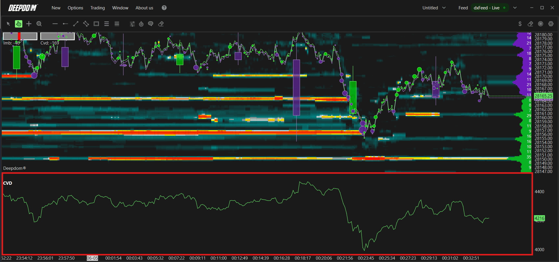
5. CVD — Cumulative Volume Delta
The CVD tracks the running total of the difference between buying and selling volume over time, giving you a continuous picture of whether the market is being driven by aggressive buyers or aggressive sellers across the entire session. Unlike a single volume bar which only tells you what happened in one period, the CVD shows you the bigger story building underneath price — whether buying pressure is consistently accumulating, consistently fading, or diverging from where price is going. That last point is where CVD becomes especially powerful: when price is making new highs but CVD is falling, it means the upward price move is not being backed by genuine aggressive buying — sellers are quietly absorbing the move and a reversal is likely. The same works in reverse. This makes CVD one of the best tools available for spotting exhaustion and divergence before price gives any obvious signal on the chart.
Enable the Cumulative Volume Delta (CVD) and it lets you define its main parameters :
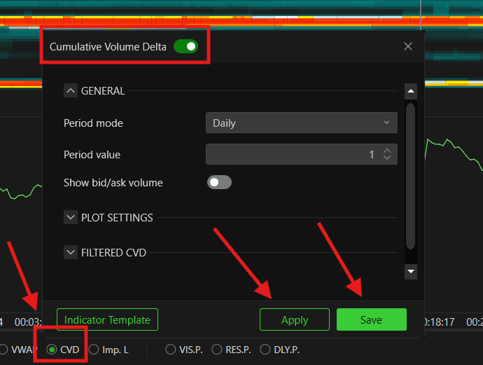
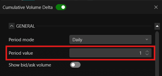
General
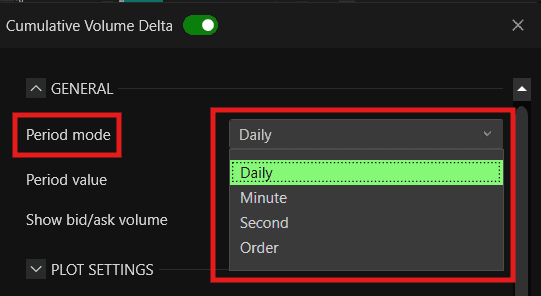
Period Mode — defines the time period for the CVD calculation. You can choose Daily, Minutes, Seconds, or Orders
Period Value — sets the numeric value for the period chosen above
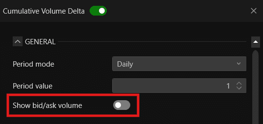
Show Bid/Ask Volume — when enabled, displays the Bid and Ask volume separately alongside the delta
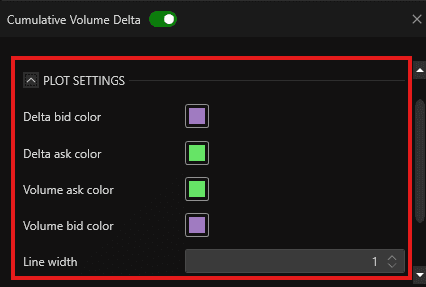
Plot Settings
Delta Bid Color — sets the color for the delta on the Bid side
Delta Ask Color — sets the color for the delta on the Ask side
Volume Ask Color — sets the color for the Ask volume line
Volume Bid Color — sets the color for the Bid volume line
Line Width — sets the thickness of the CVD lines
Filtered CVD
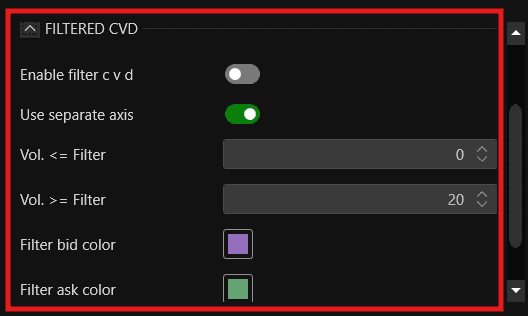
Enable Filter CVD — when enabled, applies a volume filter to the CVD calculation, showing only trades that meet the defined volume criteria
Use Separate Axis — when enabled, the filtered CVD is plotted on its own axis separately from the main CVD
Vol. <= Filter — sets the maximum volume threshold for the filter
Vol. >= Filter — sets the minimum volume threshold for the filter
Filter Bid Color — sets the color for the filtered Bid delta
Filter Ask Color — sets the color for the filtered Ask delta
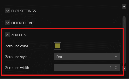
Zero Line
Zero Line Color — sets the color of the zero line
Zero Line Style — sets the style of the zero line — Solid, Dash, Dot, Dash Dot, or Dash Dot Dot
Zero Line Width — sets the thickness of the zero line
CVD View -
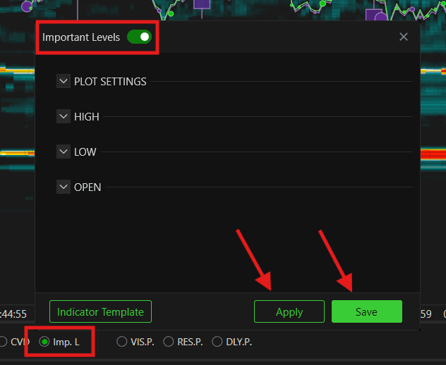
6.Imp L. — Important Levels
The session High, Low, and Open are the three most universally watched price levels by every type of trader in the market — from retail to institutional. The Open tells you where the session began and acts as an immediate reference for whether the market is accepting or rejecting the opening price. The session High and Low tell you the boundaries of accepted value so far — these are the levels where price was rejected and turned around, meaning they represent real supply and demand decisions made by the market. When price returns to any of these levels, it is not random — participants who traded at those levels earlier in the session are still there, still aware of those prices, and will react when price returns to them. Having these levels plotted automatically on your chart means you always have the most critical reference points visible at a glance, so you never miss a potential reaction zone while focusing on order flow and DOM activity.
Quickly enables Important Levels for the session — session high, low, and open. Once enabled, click the settings icon to configure:
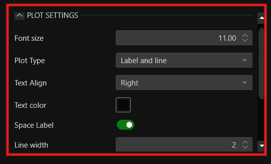
Plot Settings
Font Size — sets the size of the text labels displayed next to each level
Plot Type — defines how the level is displayed on the chart. You can choose between Label and Line, Label only, or Line only
Text Align — sets the alignment of the text label. You can choose between Left, Center, or Right
Text Color — sets the color of the text labels
Space Label — when enabled, adds spacing between the label and the line for better readability
Line Width — sets the thickness of the level lines
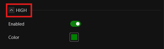
High
Enabled — show or hide the session High level on the chart
Color — sets the color of the session High line
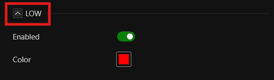
Low
Enabled — show or hide the session Low level on the chart
Color — sets the color of the session Low line
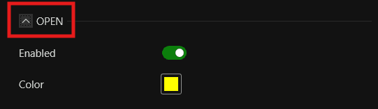
Open
Enabled — show or hide the session Open level on the chart
Color — sets the color of the session Open line
Important Levels View -
7. VIS. P. — Visible Profile
The Visible Profile shows you the volume distribution across only the price range currently visible on your screen. This is useful because it updates dynamically as you scroll or zoom — wherever you look on the chart, it instantly recalculates and shows you where the most and least trading activity happened within that view. This makes it ideal for quickly understanding which price levels attracted the most participation in any specific area you are analyzing.
Enables the Visible Profile - You can choose the profile type to display:
Volume
Delta
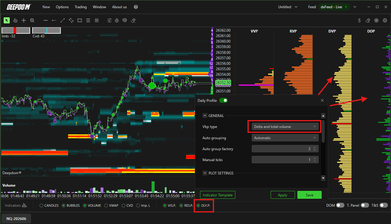
Delta and Total Volumes
Bid/Ask Volume
8. RES. P. — Resettable Profile
Enables the Resettable Profile — The Resettable Profile gives you the ability to start measuring volume distribution from any moment you choose. Instead of being locked to a fixed time period, you can reset it after a news event, a breakout, or any significant market moment and immediately begin tracking how volume is building from that point forward. This makes it one of the most flexible tools for understanding how the market is repositioning in real time after a key event.
9. DLY. P. — Daily Profile
Enables the Daily Profile — Daily Profile The Daily Profile shows you the full volume distribution across the entire trading day in one view. This gives you a clear picture of where the majority of the day's volume has been traded, where the market has spent the most time, and where thin areas exist. These high and low volume zones are critical reference points because price tends to move quickly through low volume areas and stall or reverse at high volume nodes.
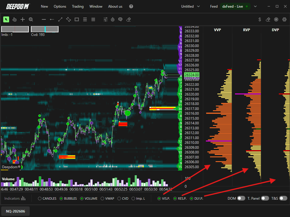
Note: To display both the Volume Profile and the Delta Profile at the same time, select Delta and Total Volumes in the profile type selector.
10. DOM
The DOM gives you something no price chart can — a live look at where orders are waiting before price even gets there. Instead of reacting to what already happened on the chart, you can see in real time where large buyers and sellers are positioned, whether they are adding to or pulling their orders as price approaches, and which side of the market is genuinely committed. This makes it one of the most direct tools available for understanding what is likely to happen next, rather than what already has.
Enables the Chart DOM - (Depth of Market) directly on the chart, showing you the live order book alongside your Heatmap data :
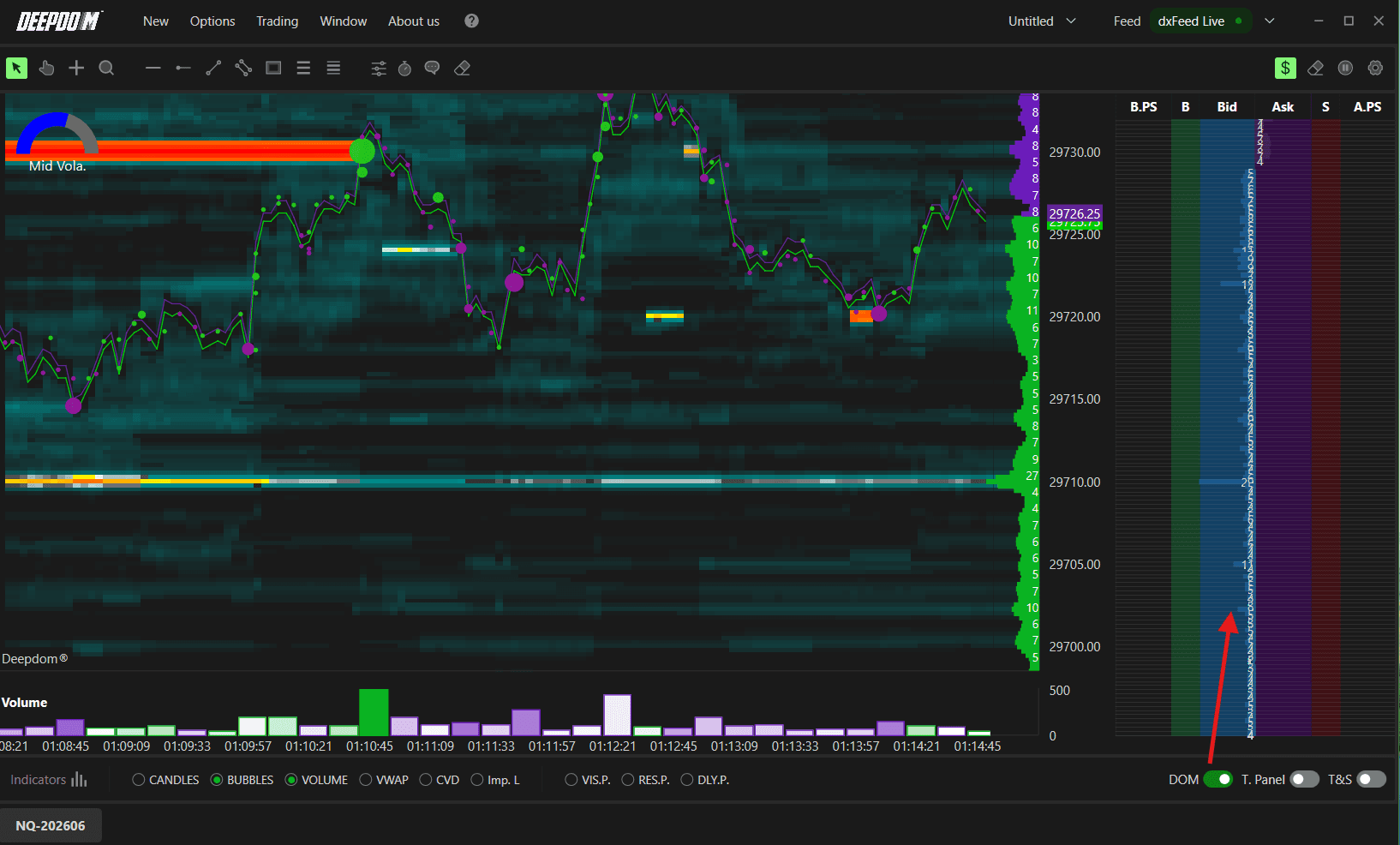
NOTE - For a full explanation, refer to the Settings DOM part under Settings below in the same article.
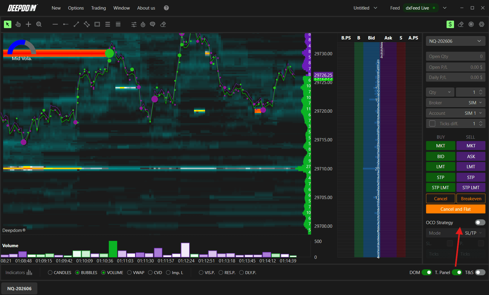
11. T. Panel
Trading Panel The Trading Panel exists so you never have to leave your chart to manage your trades. Everything you need — placing orders, choosing order types, managing your position, setting stop loss and take profit — is right there on the right side of the chart. This matters because in fast-moving markets, every second you spend switching between windows is a second you are not watching price. Having the ability to hit BID, ASK, LMT, STP, or MKT instantly while simultaneously reading the DOM and Heatmap means you can react to what you see without any delay, keeping your execution as close to your analysis as possible.
Enables the Trading Panel on the left side of the chart, giving you full control over order entry and position management without leaving the chart :
NOTE - For a full explanation, refer to the Trading Settings part under Settings below in the same article.
12. T&S
Time and Sales Time and Sales gives you a live record of every single trade being executed in the market — the exact time, price, and volume of each transaction as it happens. While the DOM shows you where orders are waiting and the Heatmap shows you historical liquidity, Time and Sales shows you what is actually being traded right now. This is important because it lets you see whether buyers or sellers are the aggressor at any given moment — large trades hitting the Ask repeatedly signal aggressive buying, while large trades hitting the Bid signal aggressive selling. When you combine this with the DOM, you can confirm whether the liquidity you are seeing in the order book is genuinely being absorbed or simply sitting there untouched, giving you a much clearer picture of real market conviction before making a trading decision.
Enables the Time and Sales panel — a real-time feed of every individual trade being executed in the market, showing the time, volume, and price of each transaction :

NOTE - For a full explanation, refer to the Time & Sales part under Settings below in the same article.
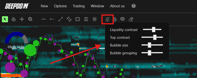
13. Sliders
Lets you adjust the visual settings of the Heatmap:
Liquidity Contrast — adjust the contrast of the liquidity colors
Top Contrast — set the upper contrast limit
Bubble Size — increase or decrease the size of Volume Bubbles
Bubble Grouping — define how price levels are grouped
14. Watch
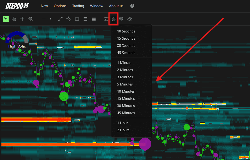
The Watch function lets you zoom into a specific time window of the heatmap so you can study a particular period of market activity in detail. Because the heatmap displays Bid and Ask liquidity visually across price levels over time, it can become very dense and difficult to read when you are looking at a large timeframe. By selecting a window — anywhere from 10 seconds all the way up to 2 hours — you can focus the view on exactly the slice of liquidity activity you want to analyze, making it much easier to see how orders were building, shifting, or being pulled at specific price levels during that period without the surrounding noise cluttering your view.
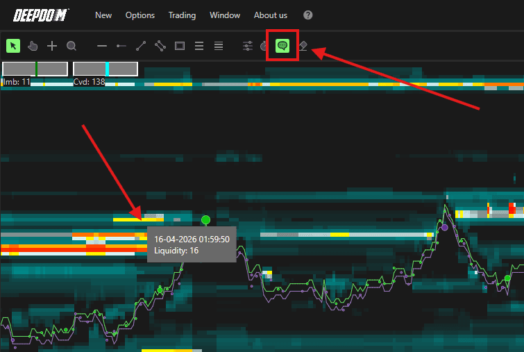
15. Text
Displays textual information about the liquidity and traded volume at the point where your cursor is positioned. Useful for a deeper understanding of Order Flow dynamics.
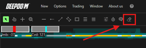
16. Eraser
Deletes all annotations currently drawn on the chart.
Navigating the Chart
X-Axis (Time) Scroll with the mouse wheel to move left or right along the time axis.
Y-Axis (Price) Right-click on the price scale to choose how you want to interact with it:
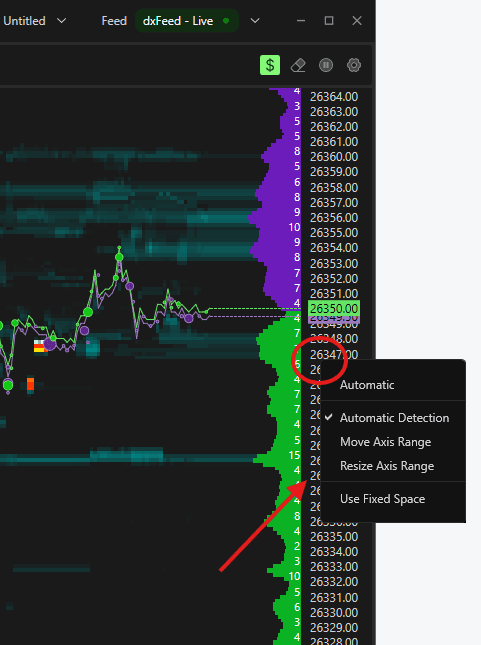
Self-Recognition Mode — position your cursor in the middle of the Y-axis and left-click to move it. Position at the top or bottom edge to resize it

Move Axis — left-click anywhere on the Y-axis to drag it up or down
Size Axis — left-click anywhere on the Y-axis to resize the price scale
Annotations & Drawing Tools
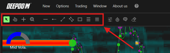
Use the Toolbar at the top of the chart to access drawing tools. From left to right:
Pointer — the default arrow cursor
Hand — lets you pan the chart in any direction
Crosshair — enables the crosshair cursor
Lens — zooms into a specific area of the chart
Horizontal Line — draws a horizontal line
Horizontal Radius — draws a horizontal radius
Line — draws a free line
Parallel Lines — draws a set of parallel lines
Rectangle — draws a rectangle
Retracements — inserts a Fibonacci retracement
Extensions — inserts Fibonacci projections
Customizing a Drawing Tool
Left-click to select the tool on the chart
Right-click to open its menu — here you can copy it, remove it, or change its properties
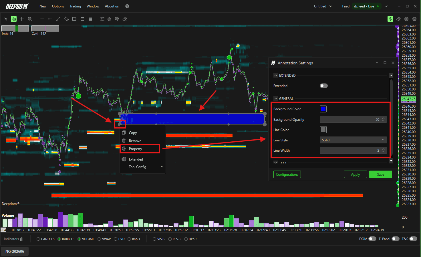
Once customized, save the configuration so you can quickly apply it again later
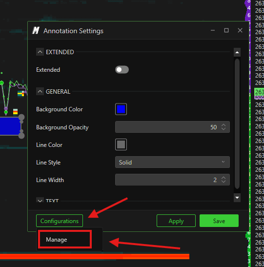
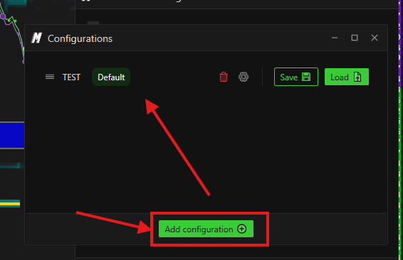
Saving & Recalling Configurations
Click Configurations at the bottom left and select Manage
Add a new configuration and give it a name
To recall it later, go to the CT menu and select from your saved configurations
Settings
Click the Settings icon in the upper right corner of the chart to access the following options:

Detached Window
Opens the chart in a separate independent window, detaching it from the main DeepDom interface. Useful when running multiple monitors and you want the chart on a different screen.
Multi-chart

Detached window

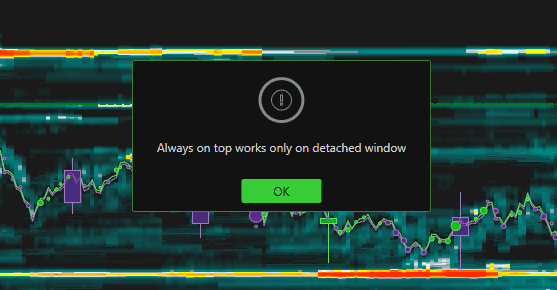
Always on Top
Keeps the detached chart window always visible in the foreground, even when you click on other applications.
Error pop - When you turn this on Main Window's from Setting, It only works on detached chart window.

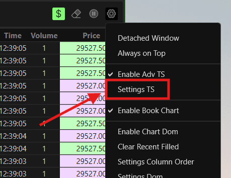
Enable Adv TS
Enables the Advanced Time & Sales panel for the chart. When enabled, the T&S panel appears on the side of the chart displaying three columns in real time:
Time — the exact time each trade was executed
Volume — the size of the trade in contracts
Price — the price level at which the trade was executed

Each row in the panel represents one individual trade execution. The background color of each row is determined by your Filter 1 and Filter 2 color settings — making it easy to instantly distinguish between different types of executions such as Bid, Ask, Above Ask, Below Bid, and Between Bid/Ask at a glance.
To configure the T&S settings, select Settings TS from the same menu.
T&S Settings
Opens the settings for the Time & Sales panel, allowing you to configure its parameters.
General
Back Color — sets the background color of the T&S panel
Border Color — sets the color of the border around the T&S panel
Font Color — sets the default text color for all entries in the panel
Font Size — sets the size of the text displayed in the panel. A larger size is easier to read but shows fewer rows at once
Bold Font — when enabled, all text in the panel is displayed in bold for easier readability
Input Data — defines what data the T&S panel uses. Set to Volume by default, meaning each row shows the volume of each individual trade execution
Show Milliseconds — when enabled, the time column shows milliseconds alongside the standard time — useful for traders who want to see exactly how fast trades are executing at a given level

Filter Settings
Filters allow you to control which trades are displayed in the T&S panel based on volume size. This is extremely useful because in a busy market, hundreds of small trades execute every second. Without a filter, the panel scrolls so fast it becomes impossible to read. By setting a minimum volume filter, you only see the trades that are large enough to be meaningful.
Filter 1 — sets the minimum volume threshold for trades to appear in the T&S panel. For example, setting this to 10 means only trades of 10 contracts or more will be shown. This is your primary filter and is always active
Enable Filter 2 — enables a second, separate volume filter on top of Filter 1
Filter 2 — sets the minimum volume threshold for the second filter
Practical Difference Between Filter 1 and Filter 2
Think of Filter 1 and Filter 2 as two layers of attention.
Filter 1 is your base layer — it removes all the small noise trades and shows you only the trades that meet a minimum size you care about. For example, setting Filter 1 to 10 means you only see trades of 10 contracts or more in the panel.

Filter 2 is your second layer — it highlights an even more significant category of trades within what Filter 1 is already showing. For example, if Filter 1 is set to 10 and Filter 2 is set to 40, the panel will show all trades of 10 contracts or more — but trades of 40 contracts or more will appear in a completely different color, making them immediately stand out.

When to use one filter:Use Filter 1 only when you simply want to cut out noise and focus on trades above a certain size. For example — a scalper on NQ might set Filter 1 to 5 to ignore tiny retail trades and only watch meaningful executions.
When to use two filters: Use both filters when you want to see two distinct categories of trade size at the same time — for example, a day trader might set Filter 1 to 10 to track all meaningful activity, and Filter 2 to 40 to specifically flag unusually large institutional-sized trades in a bright, unmissable color. When a 40+ contract trade hits, it immediately stands out — even in a fast-moving panel.

Note— Adjust Your Filters to Market ConditionsFilter values are not one-size-fits-all. Market activity changes throughout the day — during high volume sessions like the market open or a major news release, large trades happen much more frequently. During quieter periods, even a moderately sized trade can be significant.
Adjust your Filter 1 and Filter 2 values based on the current market conditions to stay focused on what actually matters at that moment. Fine-tuning your filters regularly will help you identify truly significant trades more accurately and avoid being distracted by noise.
Filter 1 — Color Settings
These settings control the colors used to highlight each type of trade execution in the T&S panel under Filter 1. Each background and text color corresponds to one of the five execution categories explained above.
Background Colors
Bid Background — background color for trades executed at the Bid (aggressive selling)
Below Bid Background — background color for trades executed below the Bid (very aggressive selling)
Between Bid/Ask Background — background color for trades executed inside the spread
Ask Background — background color for trades executed at the Ask (aggressive buying)
Above Ask Background — background color for trades executed above the Ask (very aggressive buying)
Text Colors
Bid Text Color — text color for trades executed at the Bid
Below Bid Text Color — text color for trades executed below the Bid
Between Bid/Ask Text Color — text color for trades executed inside the spread
Ask Text Color — text color for trades executed at the Ask
Above Ask Text Color — text color for trades executed above the Ask
Setting distinct, contrasting colors for each category makes it much easier to read the T&S panel at a glance — especially during fast market conditions when trades are executing rapidly.
Filter 2 — Color Settings
Filter 2 has the same color settings as Filter 1 — background and text colors for each of the five execution categories. These colors apply specifically to trades that meet the Filter 2 volume threshold, allowing you to visually distinguish very large trades from regular trades instantly.

Alert Sound
The Alert Sound section lets you set up audio notifications that trigger when trades meeting your filter criteria are detected. This means you do not have to watch the T&S panel constantly — you will hear an alert the moment a significant trade executes.
Enable Filter 1 — turns on sound alerts for trades that meet the Filter 1 volume threshold
Bid Filter 1 — select the alert sound to play when a Bid side trade meets the Filter 1 threshold
Ask Filter 1 — select the alert sound to play when an Ask side trade meets the Filter 1 threshold
Enable Filter 2 — turns on sound alerts for trades that meet the Filter 2 volume threshold
Bid Filter 2 — select the alert sound to play when a Bid side trade meets the Filter 2 threshold
Ask Filter 2 — select the alert sound to play when an Ask side trade meets the Filter 2 threshold
Using separate sounds for Bid and Ask — and for Filter 1 and Filter 2 — means you can immediately tell from the sound alone whether a large buyer or a large seller just hit the market, without even looking at the screen.

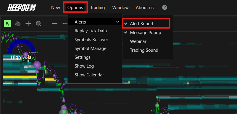
NOTE - Before adding alert >> kindly configure the sound setting from General Settings >> Alerts >> Add.

Also make sure >> the alerts are activated >> Option >> Alerts >> Alert Sound (checked).
Enable Book Chart
Enables the Book Chart view directly on the chart -
Note — DOM & Heatmap At least one of the two — Heatmap or Chart DOM — must be enabled at all times. If you try to disable both at the same time, DeepDom will show a warning and prevent it.
To view the DOM panel only, simply enable the DOM toggle from the bottom toolbar and keep the Heatmap active alongside it.

Note — Spread Bid/Ask The Book Chart also displays the Spread Bid/Ask — the distance between the best Bid and best Ask price in ticks. Monitoring the spread helps you understand current liquidity conditions. A narrow spread indicates a liquid market, while a sudden widening of the spread can signal low liquidity or high volatility — both of which can impact your order execution.
For a full explanation of the Spread Bid/Ask indicator and its alert settings, refer to the Spread Bid/Ask article.
Enable Chart DOM
Enables the Depth of Market (DOM) panel directly on the chart.

Clear Recent Filled
Clears the recently filled orders displayed on the chart.
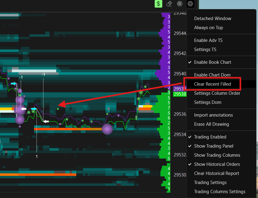
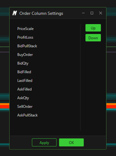
Settings Column Order
Opens the settings to configure the column layout of the order display.
Settings DOM
Opens the full configuration window for the Chart DOM. Here you can customize how the DOM panel looks and what information it displays.
General
Font Size — sets the size of the text displayed in the DOM panel
Number of Levels to Show — sets how many price levels are visible in the DOM at one time. Setting to 0 shows all available levels
Text Format — defines how numbers are formatted in the DOM. Set to Automatic by default
Auto Axis Margin % — sets the percentage of margin kept above and below the current price on the DOM axis

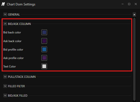
Bid/Ask Column Controls the appearance of the main Bid and Ask columns in the DOM:
Bid Back Color — sets the background color of the Bid column
Ask Back Color — sets the background color of the Ask column
Bid Profile Color — sets the color of the volume profile bar shown behind the Bid column
Ask Profile Color — sets the color of the volume profile bar shown behind the Ask column
Text Color — sets the color of the text in both Bid and Ask columns
Pull/Stack Column The Pull/Stack column shows whether liquidity is being added (stacked) or removed (pulled) at each price level in real time — helping you spot when large players are building or withdrawing orders:
Enabled — shows or hides the Pull/Stack column

Calculation Mode — defines how the Pull/Stack is calculated. Set to Avg Filter by default
Show As Profile — when enabled, displays the Pull/Stack data as a profile bar behind the column
Text Color — sets the text color in the Pull/Stack column
Bid Pull Back Color — sets the background color when liquidity is being pulled on the Bid side
Bid Stack Back Color — sets the background color when liquidity is being added on the Bid side
Ask Pull Back Color — sets the background color when liquidity is being pulled on the Ask side
Ask Stack Back Color — sets the background color when liquidity is being added on the Ask side

Filled Filter Controls which filled trades are displayed in the DOM based on volume.
Note: To see the filtered data on the DOM, you must also enable the Last Filled column — both settings work together.
Filter Input Data — defines what data is used for filtering. You can choose between:
Volume — filters filled trades based on the total volume traded at each level
Order — filters filled trades based on the number of individual orders executed
Filled Filter Min — sets the minimum threshold for a filled trade to appear in the DOM
Filled Filter Max — sets the maximum threshold for a filled trade to appear in the DOM

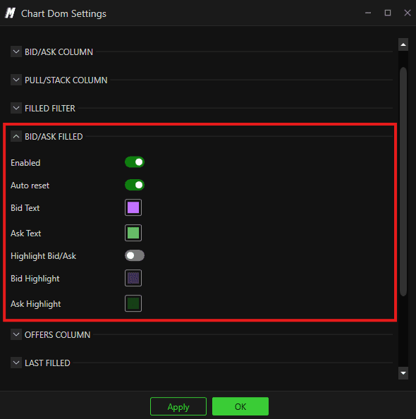
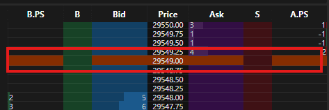
Bid/Ask Filled Shows the cumulative filled volume at each price level directly in the DOM — letting you see where the most trading activity has taken place:
Enabled — shows or hides the Bid/Ask Filled column

Auto Reset — when enabled, automatically resets the filled volume data periodically
Bid Text — sets the color of the Bid filled volume text
Ask Text — sets the color of the Ask filled volume text
Highlight Bid/Ask — when enabled, highlights price levels where significant filled volume has occurred
Bid Highlight — sets the highlight color for the Bid side
Ask Highlight — sets the highlight color for the Ask side
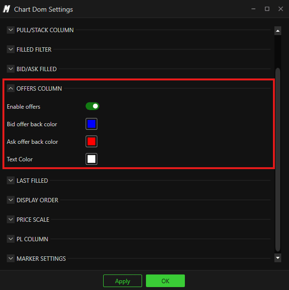
Offers Column Displays the offers (pending limit orders) at each price level in a separate column:
Enable Offers — shows or hides the Offers column
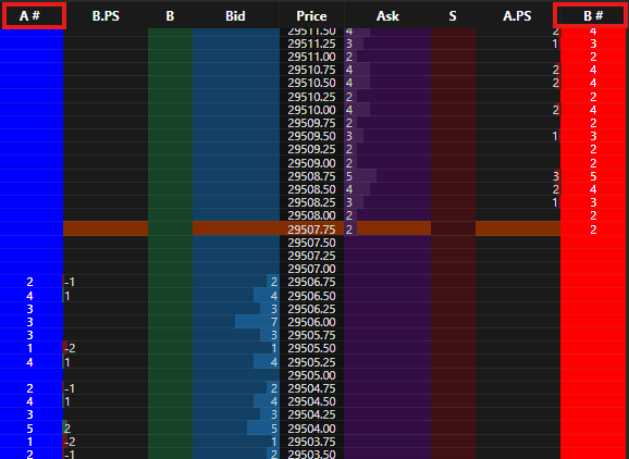
Bid Offer Back Color — sets the background color of Bid offers in the column
Ask Offer Back Color — sets the background color of Ask offers in the column
Text Color — sets the text color in the Offers column
Last Filled Shows the most recently filled trade volume at each price level:
Enabled — shows or hides the Last Filled column

Mode — defines how the last filled data is displayed. You can choose between:
Sum — accumulates and adds up all filled volume at each price level over time
Current — shows only the most recent fill at each price level, resetting with each new trade
Bid Text Color — sets the text color for Bid side last filled data
Ask Text Color — sets the text color for Ask side last filled data

Display Order Shows your open orders directly on the DOM at the price levels where they are placed:
Enabled — shows or hides your open orders on the DOM

Text Color — sets the color of the order text
Buy Order — sets the color used to display buy orders
Sell Order — sets the color used to display sell orders
Buy Background — sets the background color behind buy orders
Sell Background — sets the background color behind sell orders

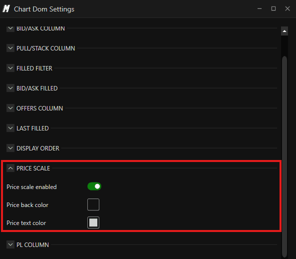
Price Scale Controls the price scale displayed alongside the DOM:
Price Scale Enabled — shows or hides the price scale on the DOM

Price Back Color — sets the background color of the price scale
Price Text Color — sets the text color of the price scale
PL Column Displays your real-time Profit and Loss at each price level relative to your open position:
Enabled — shows or hides the PL column on the DOM

Background — sets the background color of the PL column
Gain Text Color — sets the text color for price levels where your position is in profit
Loss Text Color — sets the text color for price levels where your position is in a loss

Marker Settings Controls the price markers displayed on the DOM for key session levels — making it easy to see the current price, session open, high, and low directly on the DOM:
Last Enabled — shows or hides the current Last Price marker on the DOM
Last Back Color — sets the background color of the Last Price marker
Open Enabled — shows or hides the session Open price marker
Open Back Color — sets the background color of the Open marker
High Enabled — shows or hides the session High price marker
High Back Color — sets the background color of the High marker
Low Enabled — shows or hides the session Low price marker
Low Back Color — sets the background color of the Low marker

Import Annotations
Lets you import previously saved annotations from Deepchart directly into DeepDom — so you do not have to redraw your key levels manually.

Erase All Drawing
Deletes all annotations and drawings currently on the chart in one click.

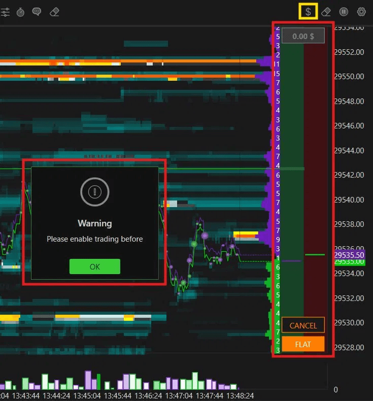
Trading Enabled
Enables or disables trading functionality directly from the chart. This must be turned on before you can place any orders from the chart — including through the Trading Columns panel or the Trading Panel.

If you try to place a trade without enabling this first, DeepDom will show a warning — "Please enable trading before."
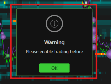
You can also enable trading quickly by clicking the $ icon in the upper right corner of the chart.

Show Trading Panel
Enables the Trading Panel on the left side of the chart. This panel gives you full control over your order entry and position management without leaving the chart.
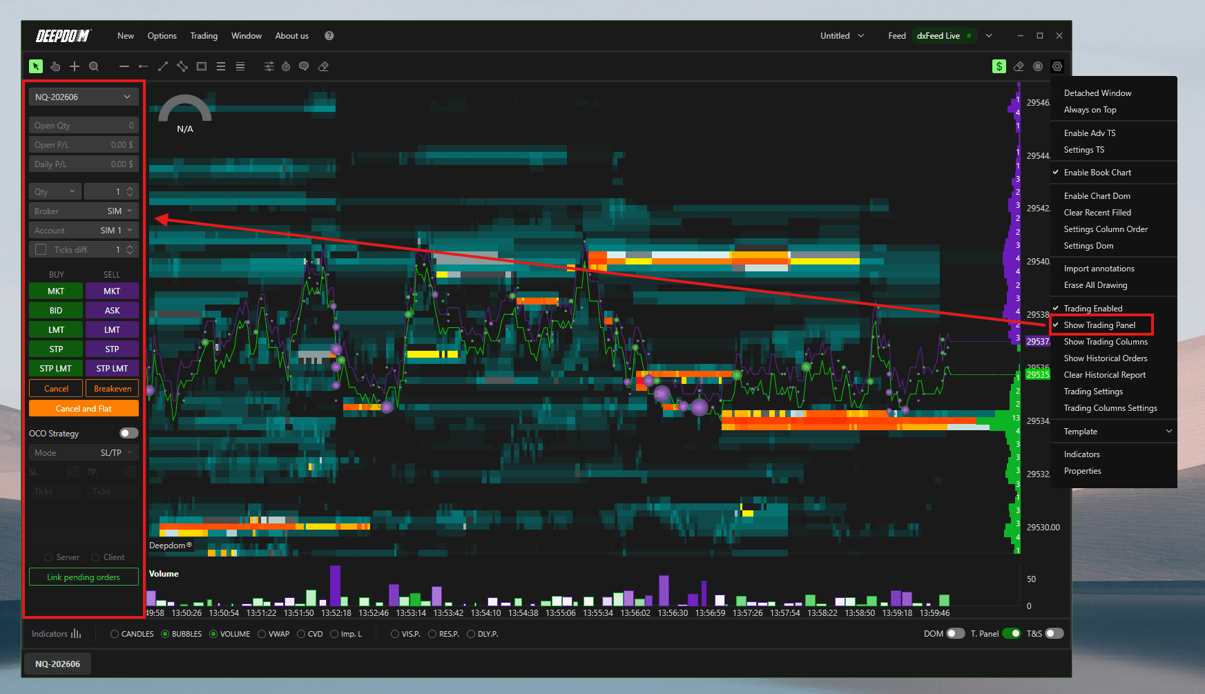
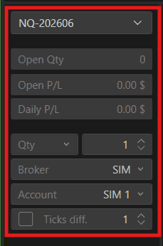
Trading Panel Overview
At the top of the panel you can see:
Symbol — the instrument you are currently trading, for example NQ-202606
Open Qty — the size of your currently open position
Open P/L — the real-time profit or loss on your open position
Daily P/L — your total profit or loss for the current trading day
Qty — sets the quantity of contracts you want to trade with each order
Broker — select the broker or connection you want to route your orders through
Account — select the trading account you want to use
Ticks Diff. — sets the number of ticks offset used for certain order types
Order Types
The panel gives you quick access to all main order types for both buying and selling:
MKT (Market Order) Executes immediately at the best available price in the market. Use this when you want to enter or exit a position right now and are not concerned about the exact price you get filled at.
BID / ASK
BID — places a buy order at the current Bid price
ASK — places a sell order at the current Ask price
LMT (Limit Order) Places an order at a specific price level you define. The order will only fill if the market reaches that price. Use this when you want to enter at a precise price rather than the current market price.
STP (Stop Order) Places a stop order that triggers and becomes a market order when price reaches a defined level. Used to enter on a breakout or to protect an open position from further losses.
STP LMT (Stop Limit Order) A combination of a Stop and a Limit order. When price reaches the stop level, instead of becoming a market order it becomes a limit order at a defined price. This gives you more control over your fill price compared to a regular stop order.
Position Management Buttons
Cancel — cancels all open pending orders for the current instrument
Breakeven — moves your stop loss to your entry price, ensuring you cannot lose on the trade
Cancel and Flat — cancels all open orders and closes your entire open position at the market price immediately
Broker & Account
Broker — select which broker or data connection to route your orders through. For example, SIM routes orders to the simulated trading environment for practice trading
Account — select which account to trade on. For example, SIM 1 is the simulated account for practice

OCO Strategy
OCO stands for One Cancels the Other. When enabled, this allows you to place two orders simultaneously — typically a Take Profit and a Stop Loss. The moment one of the two orders is filled or triggered, the other one is automatically cancelled.
OCO Strategy toggle — enables or disables the OCO Strategy for your orders
Mode — defines the OCO mode. Set to SL/TP by default, meaning one order acts as your Stop Loss and the other as your Take Profit
SL (Stop Loss) — set the Stop Loss level in ticks from your entry price
TP (Take Profit) — set the Take Profit level in ticks from your entry price
Ticks — defines the distance in ticks for both the Stop Loss and Take Profit levels
Server / Client & Link Pending Orders
Server — orders are managed directly on the broker's server. Even if DeepDom closes, your orders remain active
Client — orders are managed locally within DeepDom. If the platform closes, the orders will be cancelled
Link Pending Orders — links your pending orders so they are managed together as part of the same strategy

Show Trading Columns
Enables the Trading Columns panel directly on the chart. This is a DOM-style panel that displays alongside the price levels on the chart, allowing you to place orders directly at any price level without leaving the chart view.
From the Trading Columns panel you can place:
Limit Orders — orders placed at a specific price level, waiting for price to come to you
Stop Orders — orders that trigger automatically when price reaches a defined level
Market Orders — orders that execute immediately at the current market price
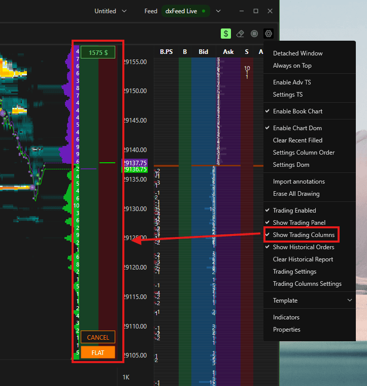
This gives you fast and precise order entry directly from the chart, making it easier to act quickly at key price levels without switching between windows.
Note — Enable Trading Before Placing Orders To place orders using the Trading Columns panel, you must first enable trading by clicking the $ icon in the upper right corner of the chart. If you try to place an order without enabling it first, DeepDom will show a warning — "Please enable trading before."
Simply click the $ icon to activate trading, and you will be ready to place orders directly from the chart.
How to Place Orders Using the Trading Columns
Limit Orders & Stop Orders — Left Click
Sell LMT — left click above the current price to place a Sell Limit order at that level
Buy STP — left click above the current price to place a Buy Stop order at that level
Buy LMT — left click below the current price to place a Buy Limit order at that level
Sell STP — left click below the current price to place a Sell Stop order at that level

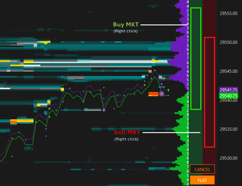
Market Orders — Right Click
Buy MKT — right click anywhere on the Bid Side of Trading Column to place a Buy Market order, executing immediately at the best available price
Sell MKT — right click anywhere on the Ask Side of Trading Column to place a Sell Market order, executing immediately at the best available price
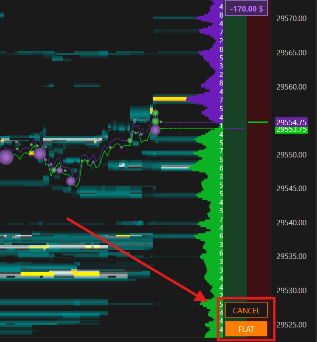
Cancel and Flat
Cancel — cancels all open pending Limit orders for the current instrument
Flat — closes all currently active open positions immediately at the market price
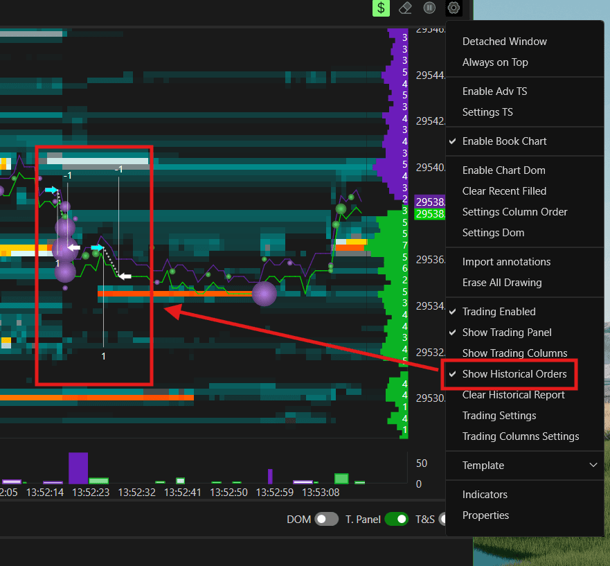
Show Historical Orders
Displays your historical orders directly on the chart for reference.
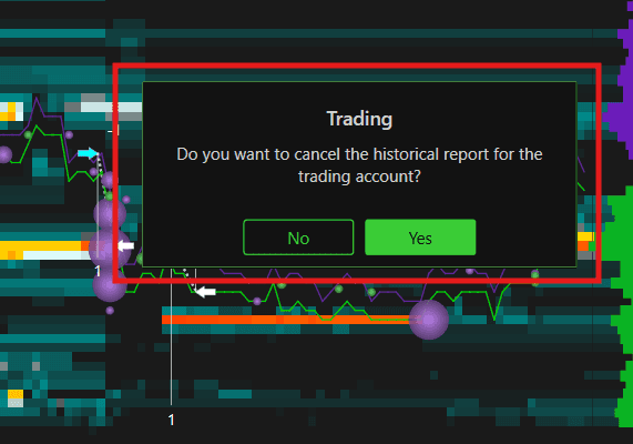
Clear Historical Report
Clears the historical order report displayed on the chart.

Trading Settings
Opens the trading configuration settings for the chart, allowing you to customize how orders and positions are displayed and managed visually on the chart.
Graphics Settings
Font Size — sets the size of the text displayed on order and position labels on the chart
Font Color — sets the color of the text on the labels
Alignment — sets the alignment of the text labels. Options include Left, Center, and Right
Show Order ID — when enabled, displays the order ID number on each order label
Show Price — when enabled, displays the price level of each order directly on the label
Show PL — when enabled, displays the real-time Profit and Loss on your open position label
Arrow Text Color — sets the color of the text displayed on the entry and exit arrows on the chart

Actions
Controls which interactive buttons and actions are available on the left and right side of order and position lines displayed on the chart:
Orders Enable Left — enables action buttons on the left side of order lines
Orders Enable Right — enables action buttons on the right side of order lines
Positions Enable Left — enables action buttons on the left side of position lines
Positions Show SL/TP on Left — shows the Stop Loss and Take Profit buttons on the left side of the position line
Positions Show Flat on Left — shows the Flat (close position) button on the left side of the position line
Positions Enable Right — enables action buttons on the right side of position lines
Positions Show SL/TP on Right — shows the Stop Loss and Take Profit buttons on the right side of the position line
Positions Show Flat on Right — shows the Flat button on the right side of the position line

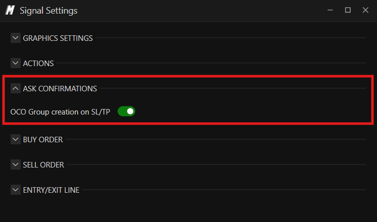
Ask Confirmations
OCO Group Creation on SL/TP — when enabled, DeepDom will ask for confirmation before creating an OCO group when placing a Stop Loss and Take Profit together
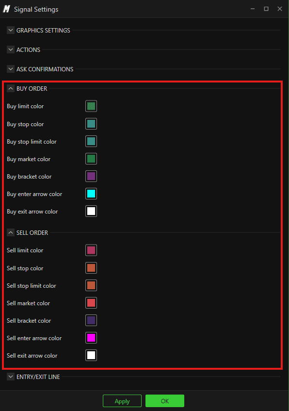
Buy Order Colors Sets the colors used to display different buy order types on the chart. Expand this section to configure colors for each buy order type.
Sell Order Colors
Sell Limit Color — sets the color for Sell Limit orders displayed on the chart
Sell Stop Color — sets the color for Sell Stop orders
Sell Stop Limit Color — sets the color for Sell Stop Limit orders
Sell Market Color — sets the color for Sell Market orders
Sell Bracket Color — sets the color for Sell Bracket orders
Sell Enter Arrow Color — sets the color of the arrow shown when a sell position is entered
Sell Exit Arrow Color — sets the color of the arrow shown when a sell position is exited
Entry/Exit Line
Enable — shows or hides the entry and exit lines on the chart. These lines mark exactly where you entered and exited a trade
Buy Line Color — sets the color of the entry/exit line for buy trades
Sell Line Color — sets the color of the entry/exit line for sell trades
Line Width — sets the thickness of the entry/exit lines
Show on Top — when enabled, the entry/exit lines are displayed on top of all other chart elements
Line Style — sets the style of the entry/exit lines. Options include Solid, Dash, Dot, Dash Dot, and Dash Dot Dot

Trading Columns Settings
Opens the full configuration window for the Trading Columns panel. Here you can customize how orders are placed and how the panel looks on the chart.
Chart Trading
Chart Trading Width — sets the width of the Trading Columns panel on the chart
Buy Order Left Below Last — defines the order type placed when clicking to the left below the last price. Default: Limit
Buy Order Left Above Last — defines the order type placed when clicking to the left above the last price. Default: Stop
Buy Order Right Below Last — defines the order type placed when clicking to the right below the last price. Default: Market
Buy Order Right Above Last — defines the order type placed when clicking to the right above the last price. Default: Market
Sell Order Left Above Last — defines the order type placed when clicking to the left above the last price on the sell side. Default: Limit
Sell Order Left Below Last — defines the order type placed when clicking to the left below the last price on the sell side. Default: Stop
Sell Order Right Above Last — defines the order type placed when clicking to the right above the last price on the sell side. Default: Market
Sell Order Right Below Last — defines the order type placed when clicking to the right below the last price on the sell side. Default: Market
Show Order Price Line — when enabled, displays a line on the chart at the price level of your open orders
Show Daily PL — when enabled, displays your daily Profit and Loss directly on the chart
Show Cancel All — when enabled, shows a Cancel All button on the chart to quickly cancel all open orders
Show Flat Position — when enabled, shows a Flat Position button to quickly close all open positions

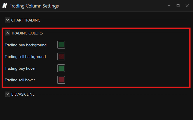
Trading Colors
Trading Buy Background — sets the background color of the buy side in the Trading Columns panel
Trading Sell Background — sets the background color of the sell side in the Trading Columns panel
Trading Buy Hover — sets the highlight color when hovering over the buy side
Trading Sell Hover — sets the highlight color when hovering over the sell side
Bid/Ask Line
Enable — shows or hides the Bid and Ask lines on the chart
Line Width — sets the thickness of the Bid and Ask lines
Bid Color — sets the color of the Bid line
Ask Color — sets the color of the Ask line

Template
Save the current chart setup as a template or load a previously saved one. Useful when you want to quickly apply the same chart configuration to a different instrument.

Indicators
An alternative way to access the full list of available indicators — same as clicking the Indicators button in the lower left corner.
Properties
To access Properties, click the Settings icon in the upper right corner of the chart and select Properties — or right-click on the chart and select Properties.
The Properties window is divided into four sections on the left:
Appearance
Heatmap
DOM Levels
Market Structure
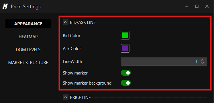
Appearance
Bid/Ask Line
Bid Color — sets the color of the Bid line on the chart
Ask Color — sets the color of the Ask line on the chart
Line Width — sets the thickness of the Bid and Ask lines
Show Marker — when enabled, displays a marker at the current Bid and Ask price level
Show Marker Background — when enabled, displays a background highlight behind the Bid and Ask markers
Marker

Bid/Ask Link
Price Line
Enabled — shows or hides the price line on the chart

Line Color — sets the color of the price line
Line Style — sets the style of the price line. Options include Solid, Dash, Dot, Dash Dot, and Dash Dot Dot
Line Width — sets the thickness of the price line
Extend Line to Left — when enabled, extends the price line all the way to the left side of the chart

Chart — Graphics Settings Click Show Settings to open the Graphics Settings window where you can configure:
Chart Area
Back Color — sets the background color of the chart
Border Color — sets the color of the chart border
Text Size — sets the size of the text displayed on the chart
Text Color — sets the color of the chart text
Horizontal Grid
Enabled — shows or hides the horizontal grid lines on the chart
Line Color — sets the color of the horizontal grid lines
Line Style — sets the style of the grid lines — for example Solid, Dash, or Dot

Heatmap (MBO/MBP)
The Heatmap tab controls how liquidity is displayed on the chart — including the color theme, grouping, and advanced MBO-based order highlighting.
General
Grouping Mode Defines how price levels are grouped together on the Heatmap:
Automatic — DeepDom automatically groups price levels based on the instrument. Recommended for most instruments
None — shows liquidity at every individual price tick with no grouping, giving you the most granular view possible

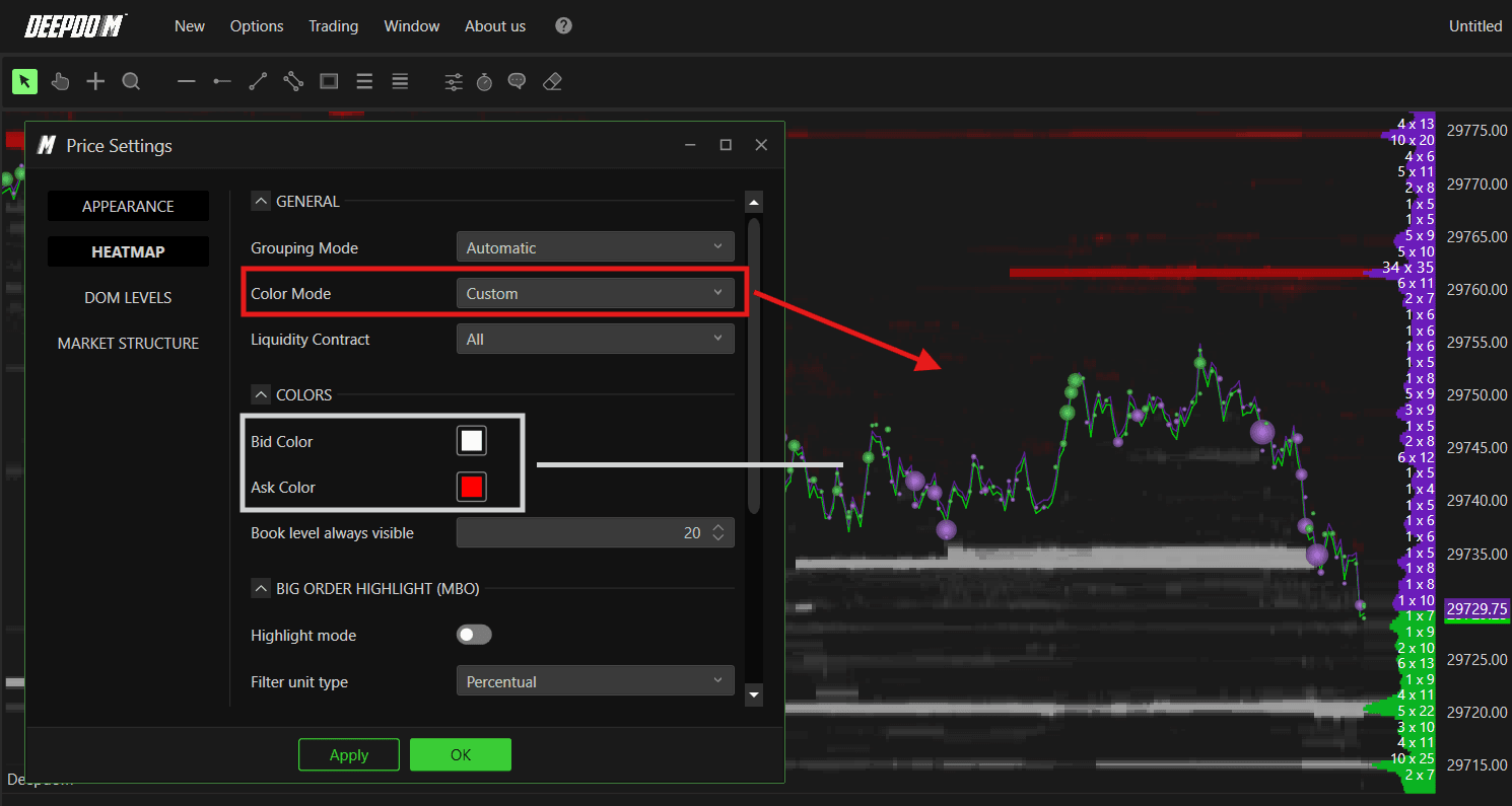
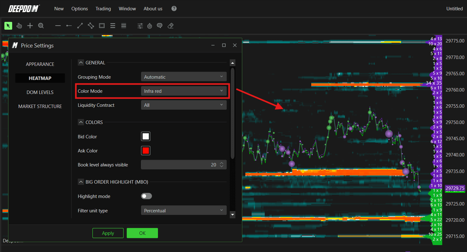
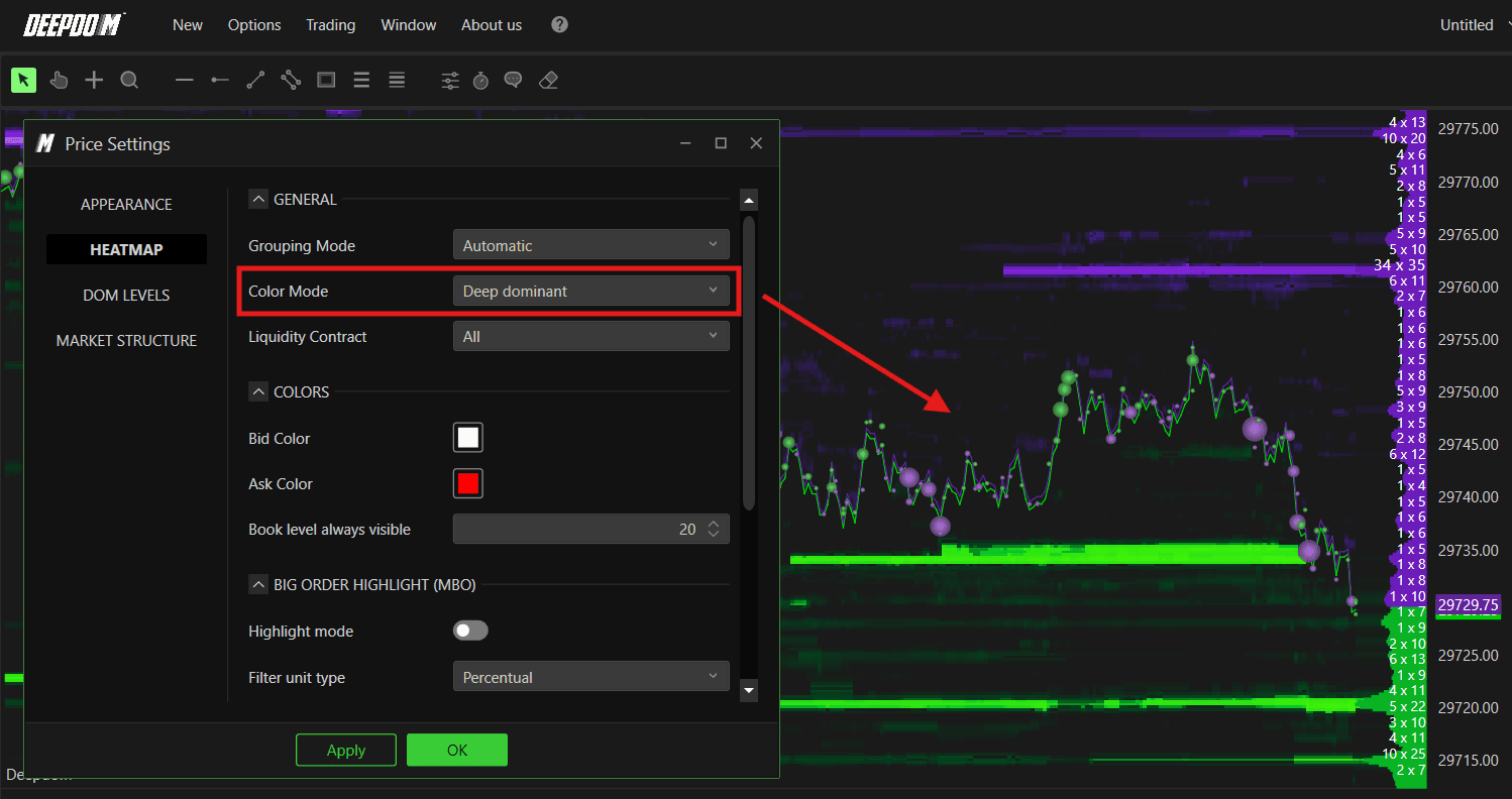
Color Mode Defines the color theme used to display liquidity on the Heatmap. Each theme changes how the Bid and Ask liquidity levels are colored across the chart — making it easier to read based on your personal preference and screen setup.
You can choose between:
Custom — when selected, the Colors section below becomes active. You can define your own Bid and Ask colors, and the Heatmap will display liquidity using a fading version of those colors. This gives you full control over the visual appearance
Infra Red — uses a warm infrared-inspired color palette ranging from deep teal for low liquidity to bright orange and white for high liquidity. Great for high contrast visibility
Deep Dominant — the default theme. Uses a deep color palette that strongly emphasizes the most dominant liquidity levels, making large orders stand out clearly
Deep Night — a darker theme with a green-toned palette. Well suited for low-light trading environments or traders who prefer a subtler chart appearance

Deep Violet — uses a violet and purple tone across the Heatmap. A visually distinct theme that many traders find easier on the eyes during long sessions

Note: After changing the Color Mode — or any setting in this window — always click Apply first, then OK to confirm the changes. Changes will not take effect until Apply is clicked.

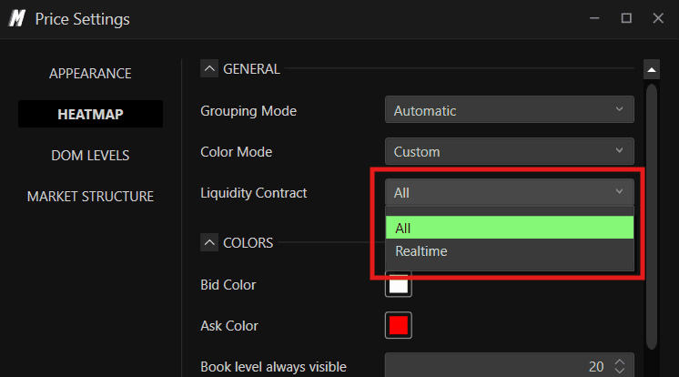
Liquidity Contract Defines which liquidity data is displayed on the Heatmap:
All — displays all liquidity including both historical and real-time data
Realtime — displays only real-time liquidity, filtering out historical book data
Colors
This section is only fully active when Custom is selected as the Color Mode. When using any other theme, these color settings do not apply.
Bid Color — sets the base color used to represent Bid (buy) liquidity on the Heatmap. The Heatmap will display a fading version of this color, with more intense shading at levels where more Bid liquidity is present
Ask Color — sets the base color used to represent Ask (sell) liquidity on the Heatmap. Same fading behavior as Bid Color
Book Level Always Visible — sets the number of book levels that are always kept visible on the Heatmap regardless of zoom level. Default is 20 — meaning the 20 closest price levels to the current price are always shown on the chart

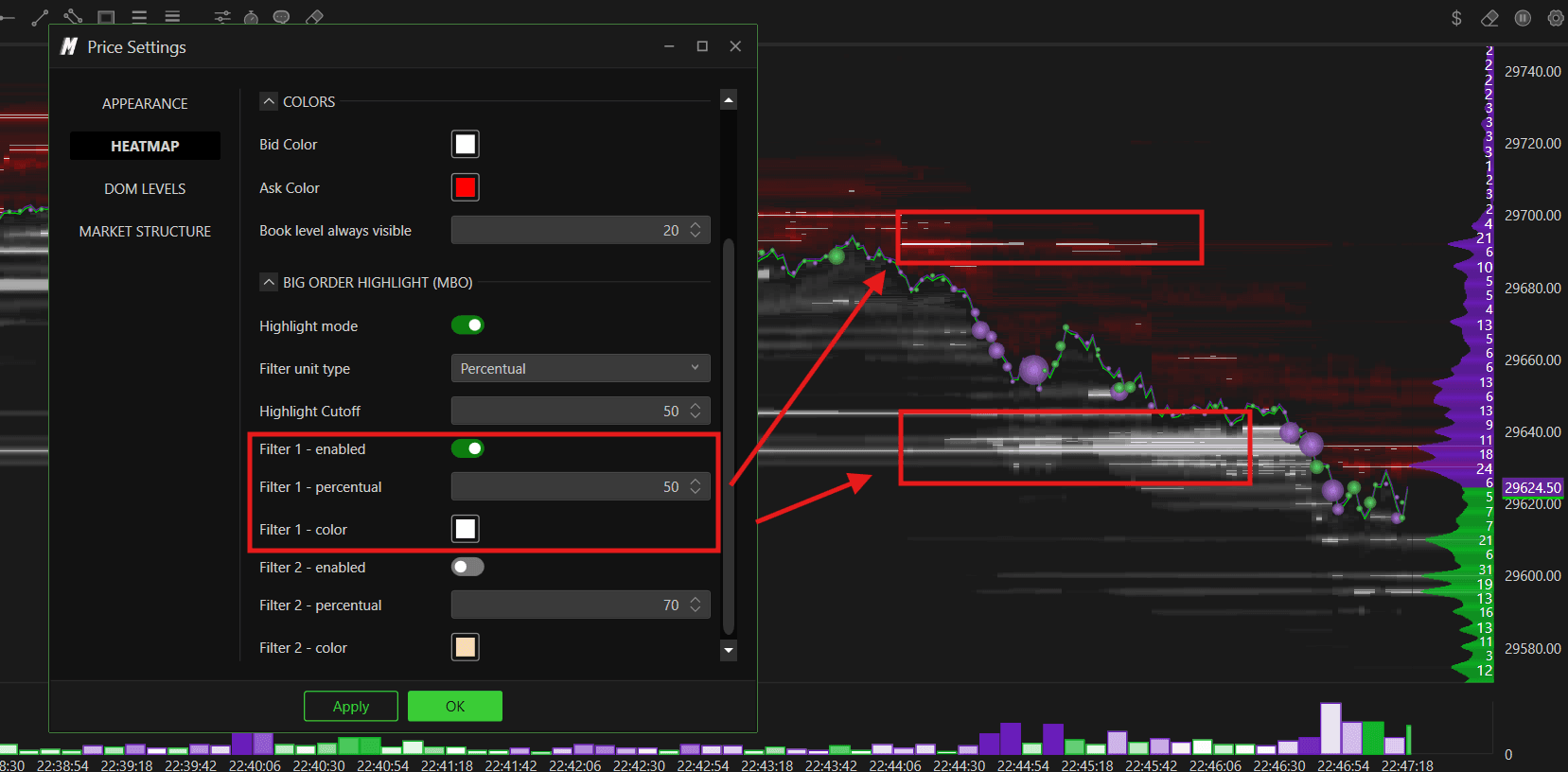
Big Order Highlight (MBO)
This section is only active when the chart Source Type is set to MBO. It allows you to visually highlight unusually large individual orders in the book — making it immediately obvious when a significant order is sitting at a price level.
This is a powerful feature because in normal market conditions, most orders in the book are small. When a genuinely large order appears — the kind placed by an institution or a large trader — it stands out visually on the Heatmap, giving you an early signal of potential support or resistance.
Highlight Mode Enables or disables the Big Order Highlight feature. When enabled, orders that exceed your defined thresholds will be visually highlighted directly on the Heatmap.
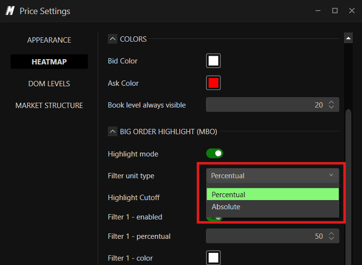
Filter Unit Type Defines how the size threshold for highlighting is measured:
Percentual — the threshold is defined as a percentage relative to all current orders in the book. For example, 50% means the top 50% largest orders will be highlighted
Absolute — the threshold is defined as a fixed number of contracts regardless of what else is in the book. For example, 500 means only orders of 500 contracts or more will be highlighted
Highlight Cutoff Sets the cutoff point above which orders are considered significant. Works together with Filter Unit Type — for example with Percentual set to 50, only orders in the top 50% of size get highlighted.
Filter 1 — Enabled Enables the first highlight filter. When active, orders meeting the Filter 1 threshold will appear highlighted on the Heatmap in the Filter 1 color.
Filter 1 — Percentual Sets the percentage threshold for Filter 1. For example, setting this to 50 means orders in the top 50% of size will be highlighted.
Filter 1 — Color Sets the highlight color for orders that meet the Filter 1 threshold.
Filter 2 — Enabled Enables the second highlight filter — allowing you to define a second, higher threshold to highlight even larger orders in a different color.
Filter 2 — Percentual Sets the percentage threshold for Filter 2. For example, setting this to 70 means only orders larger than the Filter 2 threshold will be highlighted in the Filter 2 color — these are the most significant orders.
Filter 2 — Color Sets the highlight color for orders that meet the Filter 2 threshold.
Using two filters together gives you two visual tiers of significant orders — for example, highlighting large orders in one color and extremely large orders in a more prominent second color. This makes it instantly clear which levels have the most significant liquidity sitting in the book.

Note — MBO Required The Big Order Highlight feature requires your chart to be set to MBO as the data source. To enable this, right-click on the chart, select Source Settings, and set the Source Type to MBO. If your data feed does not support MBO, this feature will not display any data.
DOM Levels (MBO/MBP)
The DOM Levels tab controls how the order book levels are displayed on the right side of the chart — showing you the live Bid and Ask quantities at each price level directly alongside the Heatmap.
Colors
Bid Background — sets the background color of the Bid side in the DOM Levels panel
Bid Font — sets the text color of the Bid side numbers
Ask Background — sets the background color of the Ask side in the DOM Levels panel
Ask Font — sets the text color of the Ask side numbers
Font Size — sets the size of the text displayed in the DOM Levels panel
Text — Display Mode
Defines what data is shown as text on each DOM level. You can choose between three options:
MBP — displays the standard Market By Price quantity at each level. This shows the total combined volume sitting at each price level in the book. For example, a level showing "14" means there are 14 contracts of limit orders sitting at that price

Biggest MBO — displays the size of the single largest individual MBO order at each price level. For example, instead of showing the total of all orders at a level, it shows only the biggest one. This is useful for spotting large individual orders that may be hiding within a larger total. As seen in the chart, you will see numbers like "17" or "24" representing the size of the largest single order at that level
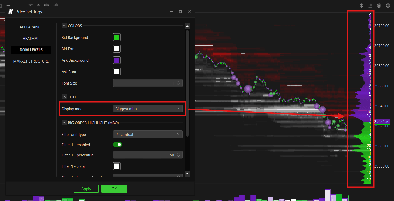
MBP with Bigger MBO — displays both values together at each level. For example, you may see "10 x 13" — where 10 is the MBP total volume and 13 is the biggest individual MBO order at that level. This gives you the most complete picture — you can see the total liquidity and the largest individual order at the same time

Big Order Highlight (MBO)
This section works the same way as the Big Order Highlight in the Heatmap tab — but applies specifically to the DOM Levels panel. It visually highlights unusually large individual orders directly in the DOM level numbers on the chart.
Filter Unit Type Defines how the size threshold is measured:
Percentual — threshold defined as a percentage relative to all current orders in the book
Absolute — threshold defined as a fixed number of contracts
Filter 1 — Enabled Enables the first highlight filter for DOM Levels.
Filter 1 — Percentual Sets the percentage threshold for Filter 1. Orders meeting this threshold will be highlighted in the Filter 1 color.
Filter 1 — Color Sets the highlight color for orders meeting the Filter 1 threshold.
Filter 1 — Increase Font Size Increases the font size of DOM level numbers that meet the Filter 1 threshold — making large orders even more visually prominent on the chart.
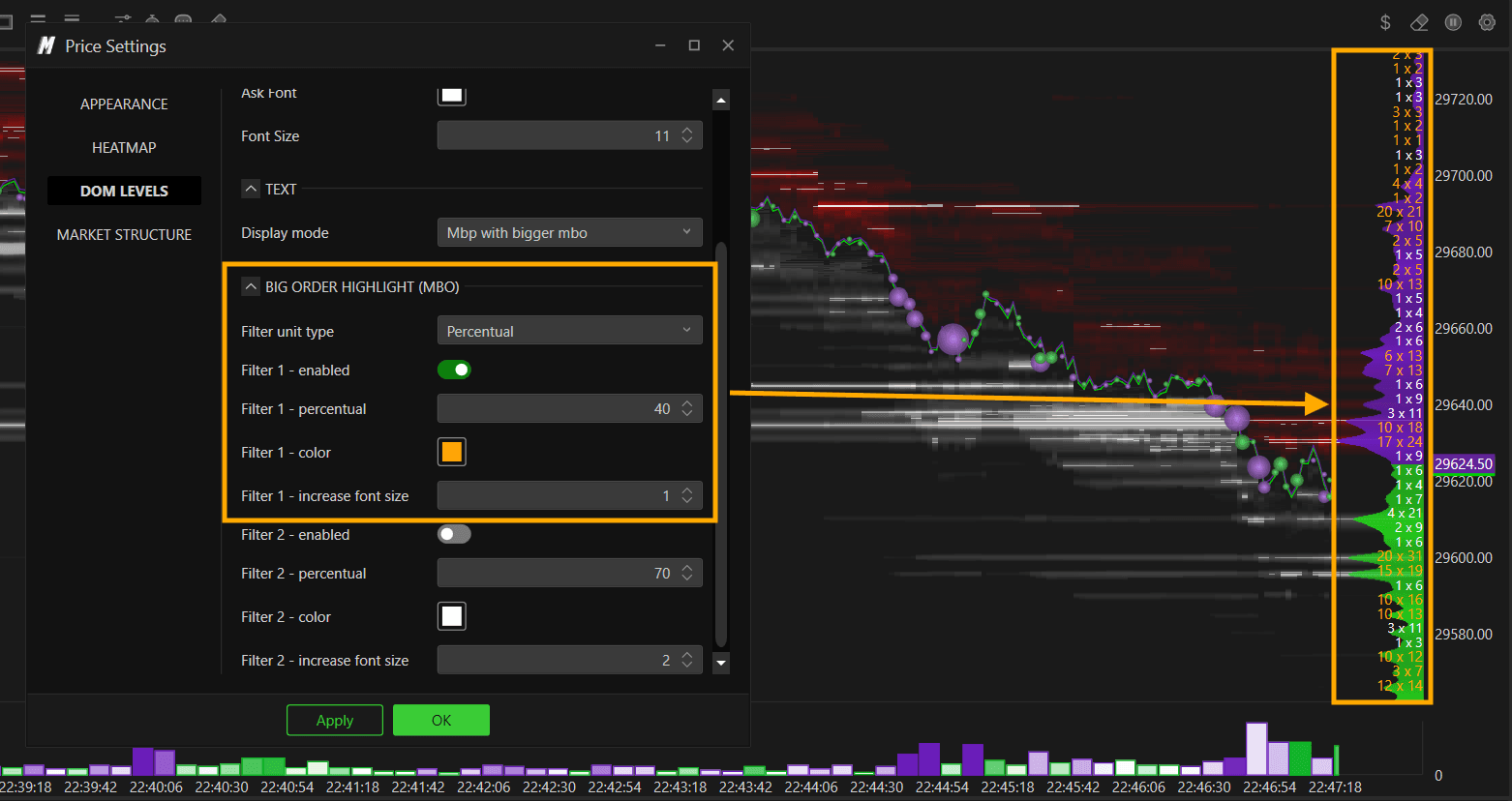
Filter 2 — Enabled Enables the second highlight filter for DOM Levels.
Filter 2 — Percentual Sets the percentage threshold for Filter 2 — typically set higher than Filter 1 to catch only the most significant orders.
Filter 2 — Color Sets the highlight color for orders meeting the Filter 2 threshold.
Filter 2 — Increase Font Size Increases the font size of DOM level numbers that meet the Filter 2 threshold — making the most significant orders stand out even more clearly.

Note — MBO Required The Big Order Highlight feature requires your chart to be set to MBO as the data source. To enable this, right-click on the chart, select Source Settings, and set the Source Type to MBO. If your data feed does not support MBO, this feature will not display any data.

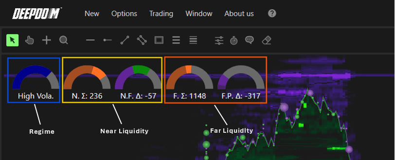
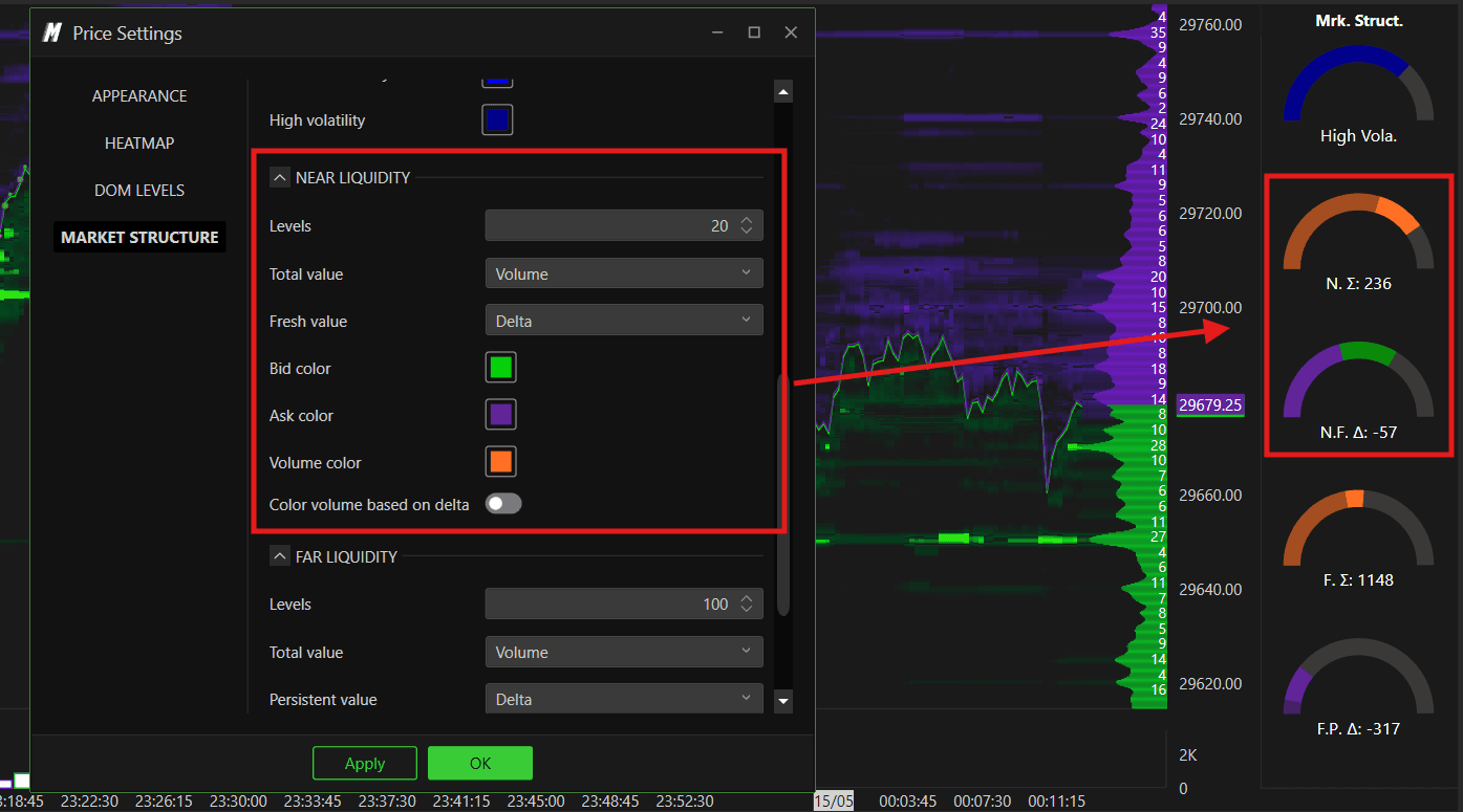
Market Structure
The Market Structure tab enables a powerful sentiment meter that gives you a real-time visual read of current market conditions. It analyzes the liquidity sitting in the order book — both near and far from the current price — and displays the result as visual gauge meters on the chart.
There are three meters displayed:
Regime meter — shows the current volatility level of the market based on a combination of historical and current data behavior
Near Liquidity meter — shows the sentiment based on liquidity sitting close to the current price
Far Liquidity meter — shows the sentiment based on liquidity sitting further away from the current price
General
Enable — turns the Market Structure meter on or off

Minutes for Comparison — this controls the comparison arc you see on the meter gauge. The meter shows two layers — the current reading and a comparison reading from the past. This setting defines how many minutes back the comparison is taken from. For example, setting this to 5 means the meter compares the current liquidity state against how it looked 5 minutes ago — letting you see at a glance whether conditions are improving or deteriorating
Minutes for Scaling — defines the time window used to scale the meter values. A larger value gives a smoother, more stable reading. A smaller value makes the meter more reactive to recent changes
Dedicated Chart Area — when enabled, the meters open in a dedicated panel on the right side of the chart. When disabled, they appear in the upper left corner

Meter Style
Controls the visual appearance of the meter gauges:
Background — sets the background color of the meter panel
Line Width — sets the thickness of the meter arc
Text Size — sets the size of the text on the meter
Text Color — sets the color of the text on the meter
Compare Opacity — controls how visible the comparison arc is on the meter. A lower value makes it more transparent, a higher value makes it more prominent

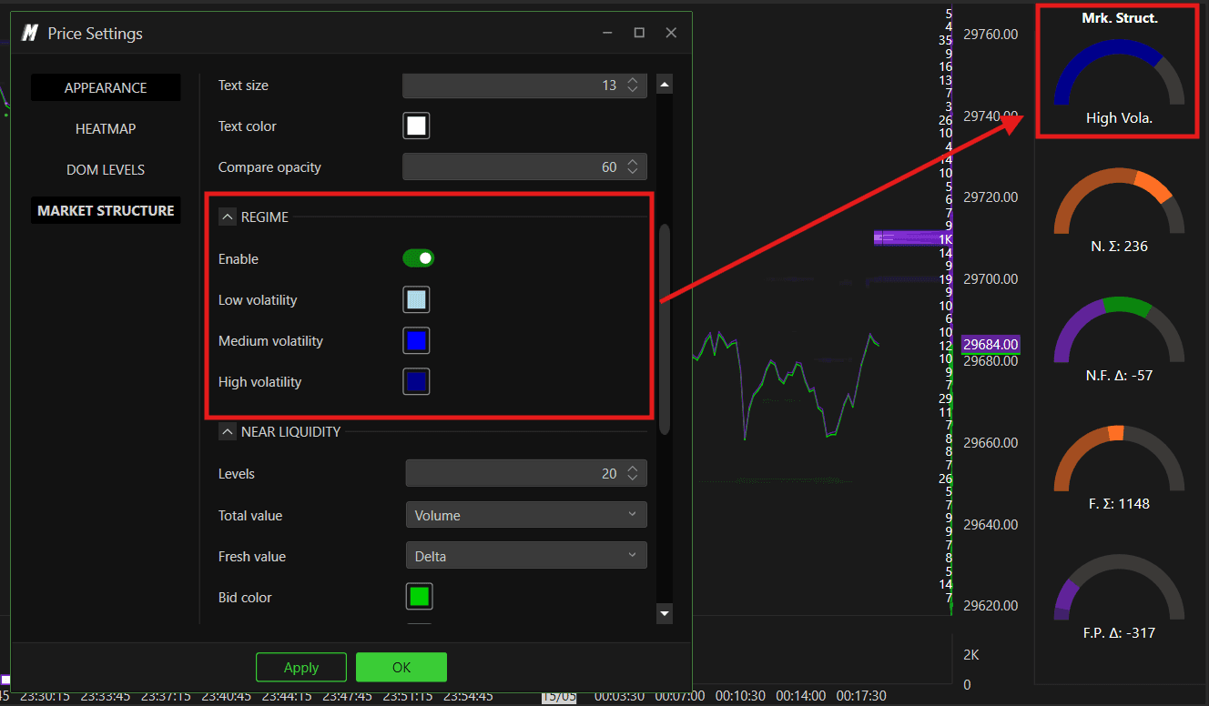
Regime
The Regime meter is the top meter on the panel. It analyzes a combination of historical market data and current price behavior to determine the current volatility state of the market — and displays it as a color-coded gauge.
Think of it as a market temperature reading. It tells you at a glance whether the market is calm, moderately active, or extremely volatile right now — based on how current behavior compares to historical patterns for that instrument.
Enable — turns the Regime volatility meter on or off
Low Volatility — sets the color shown on the meter during low volatility conditions
Medium Volatility — sets the color shown during medium volatility conditions
High Volatility — sets the color shown during high volatility conditions — for example when the meter displays "High Vola." in blue it means the market is currently in a high volatility regime
Near Liquidity
The Near Liquidity meter measures the sentiment based on the liquidity sitting closest to the current price in the order book. By default it looks at the 20 levels directly above and below the current price — giving you a real-time read of the balance between buyers and sellers in the immediate area where price is trading right now.
This meter uses fresh data only — meaning it reflects what is happening in the book right now, not historical averages.
How it works in simple terms: DeepDom looks at the 20 closest price levels on both the Bid and Ask side. Based on the data type you select — Volume, Delta, or Imbalance — it calculates a sentiment value and displays it on the gauge. A reading of N. Σ: 216 for example means the near liquidity sum is currently 216, reflecting the balance of activity in those closest levels.
Levels — sets how many book levels above and below the current price are included in the calculation. Default is 20
Total Value — defines what data is used to calculate the total value shown on the meter. Options include:
None — no total value displayed
Volume — uses total volume at the near levels
Delta — uses the difference between buying and selling volume at the near levels
Imbalance — uses the order book imbalance at the near levels
Fresh Value Defines what data is used for the fresh (most recently updated) reading on the meter. Fresh liquidity refers to orders that have just appeared in the book. Options include:
None — no fresh value displayed on the meter
Volume — uses the most recently added volume at the near levels
Delta — uses the difference between the most recent buying and selling activity at the near levels
Imbalance — uses the most recent order book imbalance at the near levels
Bid Color — sets the color representing Bid liquidity on the meter
Ask Color — sets the color representing Ask liquidity on the meter
Volume Color — sets the color representing volume on the meter
Color Volume Based on Delta — when enabled, the volume color on the meter changes dynamically based on whether the delta is positive or negative — giving you an instant color-coded read of whether buyers or sellers are currently dominant in the near levels
Far Liquidity
The Far Liquidity meter works the same way as Near Liquidity — but looks much further out in the order book. By default it covers 100 levels from the current price, giving you a broader picture of where large passive orders are sitting deeper in the book.
This meter also uses fresh data only — reflecting current book conditions rather than historical data.
While Near Liquidity tells you what buyers and sellers are doing right next to the current price, Far Liquidity tells you about the bigger picture — whether there is heavy passive liquidity building up further away, which could act as future support or resistance as price moves toward those levels.
Levels — sets how many book levels are included in the Far Liquidity calculation. Default is 100
Total Value — same options as Near Liquidity — None, Volume, Delta, or Imbalance
Persistent Value — Defines what data is used for the persistent reading on the meter. Persistent liquidity refers to orders that have been sitting in the far levels for a sustained period — orders that continue to hold their position in the book without being cancelled. Options include:
None — no persistent value displayed on the meter
Volume — uses the sustained volume sitting at the far levels over time
Delta — uses the difference between buying and selling activity that has persisted at the far levels
Imbalance — uses the order book imbalance that has been consistently present at the far levels
Bid Color — sets the color representing Bid liquidity on the Far Liquidity meter
Ask Color — sets the color representing Ask liquidity on the Far Liquidity meter
Volume Color — sets the color representing volume on the Far Liquidity meter
Color Volume Based on Delta — when enabled, the volume color changes based on delta direction — showing at a glance whether the dominant pressure in the far levels is from buyers or sellers

Note After changing any setting in this window, always click Apply first then OK to confirm the changes.
Conclusion
The Heatmap gives you a complete view of both liquidity and market execution in one chart. Once you are comfortable navigating it, exploring the indicator and annotation tools will significantly deepen your understanding of Order Flow and market structure.
Still Having Trouble?
Our support team is available 24/7 and ready to help you with any issue you encounter.
When reaching out, please include:
A screenshot of the issue
A brief description of what you were trying to do
Support Ticket (Fastest Response) Visit www.deepcharts.com and create a support ticket directly on our website.
Email Support Reach us at support@deepcharts.com — please note that email responses may take a little longer than a support ticket.